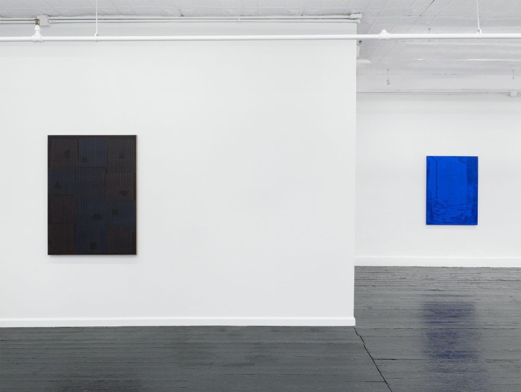
Contributed by Jacob Cartwright / There’s a quiet conversation happening on either side of the Grand Street subway stop between two artists who, measured as they are, have a lot to say to each other. To the west is Alison Hall’s “spirits (where the water tastes like wine)” at Kate Werble Gallery, to the east Pete Schulte’s “Neither-Nor Stone or Not Not-a-Rock” at McKenzie Fine Art. The more you look for correspondences the more you find, and the fact that their bodies of work are not overtly similar means that each stands to illuminate the other.
Hall’s bifurcated blue and black paintings respectively distill the painted ceiling and tiled floor of the Scrovegni Chapel in Padua, Italy. The chapel is a cornerstone of European tours, thanks to its 14th-century fresco cycle by Giotto, and has been a regular destination for Hall. One doesn’t need a press release or a degree in art history to see that the gemstone blue and coal black paintings represent heaven and earth. The blue paintings quote directly from the chapel’s barrel-vaulted ceiling, where Giotto embraced the use of gold pigment in the Byzantine tradition to create a shimmering grid of light within his encompassing blue field. Hall has identified a corresponding quality in graphite, and her paintings are structured around its flashes from light to dark, within an oceanic outlay of blue pigment.
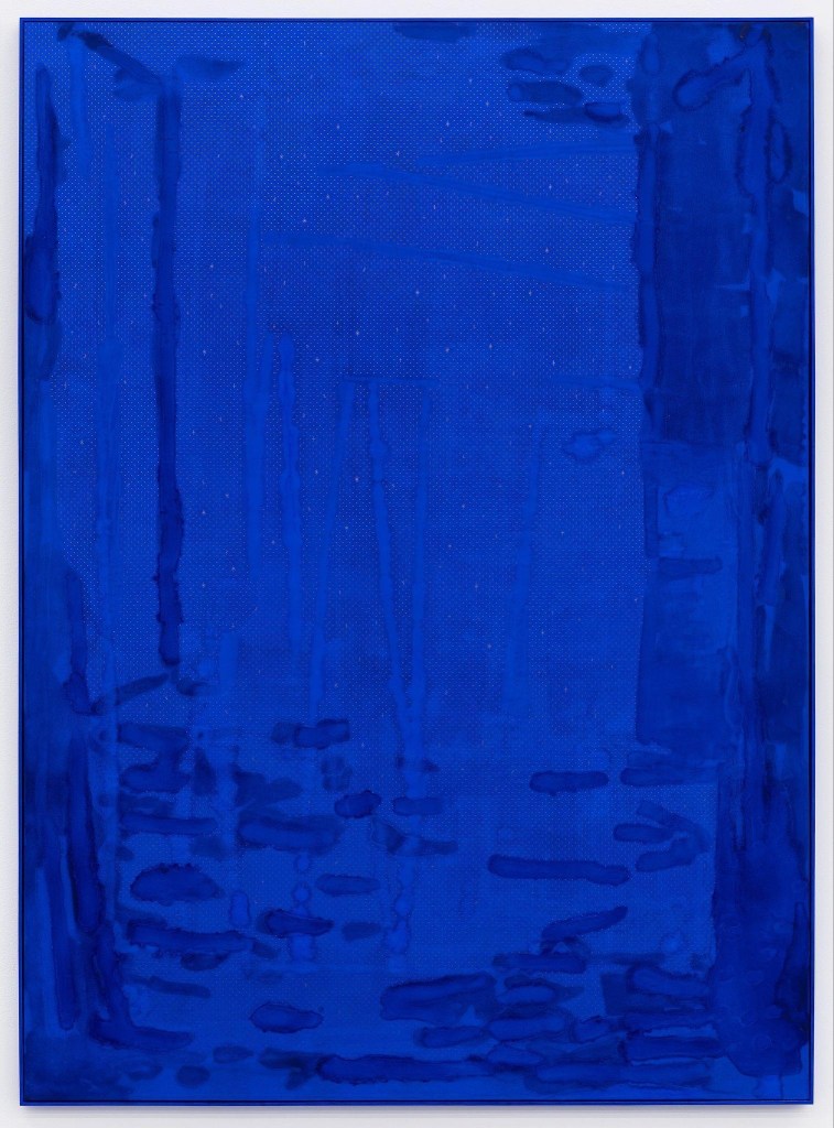
on panel, artist frame, Virginia maple, plaster and oil, 48 ½ × 35 ½ inches
Hall takes Giotto’s luxurious blues and their vast articulation of (literal) space and places them in productive tension with her painterly mark-making, which keeps the attention on the surface of the paintings. Her gestures register like stains interrupting immaculate surfaces and their quality of deep space, which seems to collapse the depth of the painted cosmos into a shallow and subjectively articulated picture plane. Centuries of painting are compressed here, from the expansion of modeled and volumetric space during the proto-Renaissance era to the anti-illusionistic flattening of the New York School. Beyond that, the paintings serve as elegant visual poems, inviting reverie. The brightest stars in the night sky are in the constellation of Orion, roughly 700 light-years away. That twinkling light was emitted in Giotto’s time. When Hall evokes fourteenth-century frescoes in her consideration of post-Minimalist art, she affirms that great paintings, like the stars, are time machines.
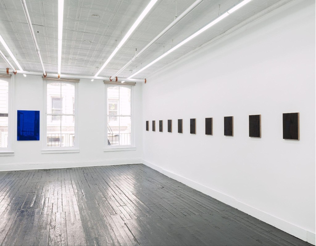
In the black paintings, Hall’s color relationships are thrillingly subtle, presented in a uniform way such that they first read as an unyielding Minimalist sequence. They evoke the experience of allowing your eyes to adjust in a darkened room, an architecture of low-contrasting forms gradually emerging from seemingly impenetrable black. Two distinct qualities of time are embedded here. Like a wine with a long finish, color gradients unfold at their own stately pace. The gridwork of graphite points ignites the works more immediately, blinking against the matte black plaster surfaces.
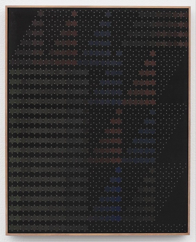
and plaster on panel, artist frame, Virginia black walnut, 14 × 11 ⅜ inches
The larger black paintings deftly evoke tiled floors that have been pieced together and repaired over time. A dozen sections, each meticulously devised, insouciantly bump up against each other. Nothing is fully misaligned, but nothing is in perfect agreement, either. That tension is both the point and the payoff, extending the paintings beyond a rumination on art history and establishing their own invented language.
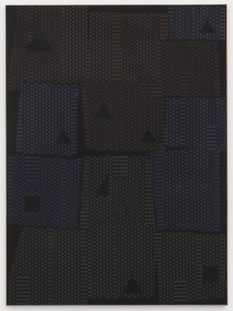
plaster on panel, artist frame, Virginia black walnut, 48 ½ × 35 ½ inches
The bridge between the blue and the black paintings is graphite. In the blue paintings, the material effectively translates Giotto’s wealth-denoting gold and deftly inverts it as a humble and familiar material from HB pencils handed out to elementary school students. And it’s perfectly honest. For all the innovations that contemporary art has ushered in, a pencil is still the main tool for laying out a painting.
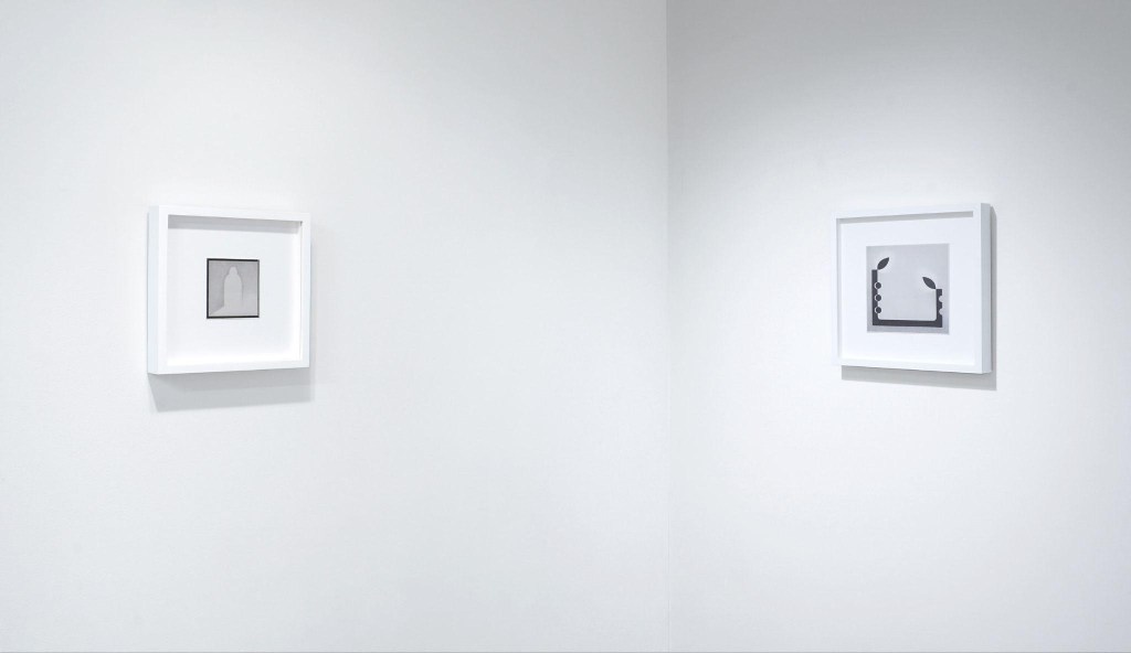
Graphite is also the most obvious bridge between Hall’s work and Pete Schulte’s drawings. Schulte’s works are built up patiently, and almost entirely, as pencil drawings. Yet, there isn’t a singular pencil mark to be found in his works on paper. The images are nudged into view, moving from accumulations of soft tonal clouds to utterly specific solid masses. It’s a particular surprise when his drawings seem to coalesce into vaporous weather systems that hang like a fog over half-described forms peering through. The silvery austerity of the works makes his judicious additions of pigment, ink, or colored pencil – which add little puffs of color to his monochromes – feel like moments of relative opulence.
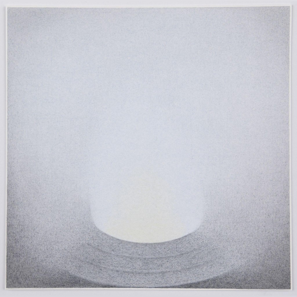
Schulte favors a symmetrical, centered format akin to what Agnes Martin employed in her transitional work from 1960–61, when she made small-scale paintings that tamed her early biomorphic surrealism, paving the way for rewards that were at once greater and more austere. In their elegant curvilinearity and immaculate refinement, Schulte’s drawings also recall Myron Stout’s mature work. Stout had a noted interest in the stone carvings of Cycladic art, and the Neolithic art of the Cyclades – with its familiar forms and unknown purposes – resonates with Schulte’s drawings as well. His forms tend to resemble signs, symbols, and iconography: esoterica and arcane symbols that you might see carved into a building from some prior century, wondering idly at their meaning while also being perfectly aware that they are inscrutable by design. Schulte has made a virtue of this tension. He is not in any rush to tell us exactly what he is thinking and clearly regards ambiguity as a creative engine.
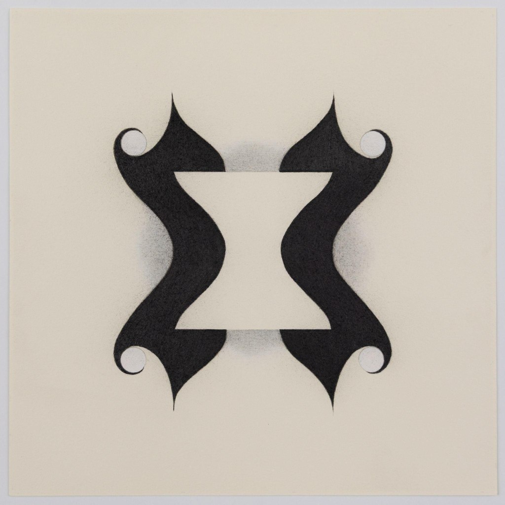
One of Schulte’s recurring motifs is a visual paraphrasing of Brancusi’s Kiss – a carved stone sculpture of an iconic love peck. Schulte may be intrigued by its impurity. The sculpture is oft-cited as an entry point to high Modernism, but it’s also a transitional work that reflects Brancusi’s debt to Rodin and the Symbolist tradition of artists like Munch, not to mention any number of the weather-worn sculptures of early human history. Schulte, for all his rigor, seems dedicated to art that leaves the door open to all sorts of worthy phenomena. Choosing not to choose allows for a surprising degree of freedom inside his self-imposed limits.
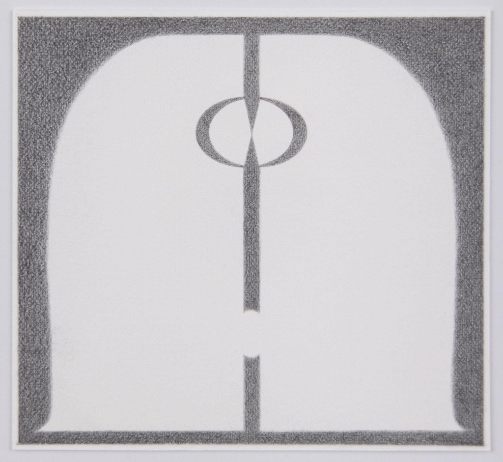
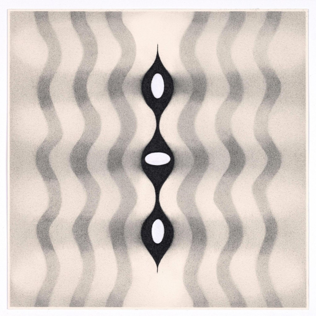
Schulte’s great strength, alongside the richness of the shrouded allusions he imparts, is his refined attention to detail. Most of the drawings in the show are less than 10 inches across, and their small scale ensures an intimate viewing experience. This signals that the viewer’s own sense memories, activated by close, patient, and attentive viewing, are the true subjects here. Both Hall and Schulte’s works coach viewers to slow down and experience them as intimate, reflective, and time-based encounters. They work with abundant and self-evident care, thus inviting their audience to join them in uncovering the rewards of subtle consideration. This quality positions them in conscious defiance of the impatient and headlong rush of our current culture and an art world that has grown accustomed to quickly telegraphed meaning.
These artists embrace a poet’s view of history, making Anne Carson’s recent selection for the Nobel Prize for Literature a fitting backdrop for this review. Carson translates the ancients with a precision for emotional truth that makes them wincingly immediate. In her marvelous essay on Cy Twombly – another artist who tapped into antiquity as though it were a fresh vein – she offers this quote from the painter: “Everything lives in the present; it’s the only time it can live.” Hall and Schulte suggest that our rich and unfathomable histories are what imbue our mindfulness of the present moment with depth. As Carson translates the Greek lyric poet Simonides: “It is in fact upon the world of things needing to be uncovered that the world of merely visible things keeps exerting its pressure.”
“Alison Hall: spirits (where the water tastes like wine),” Kate Werble Gallery, 474 Broadway, New York, NY. Through October 24, 2026.
“Pete Schulte: Neither-Nor Stone or Not Not-a-Rock,” McKenzie Fine Art, 55 Orchard Street, New York, NY. Through October 25, 2026
About the author: Jacob Cartwright is a NYC-based painter and independent curator who writes about art.