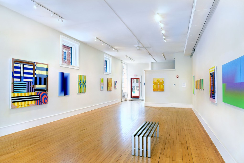
Contributed by Leslie Roberts / In “Polychrome,” Bernay Fine Art presented paintings by three painters – Jenny Kemp, Audrey Stone, and Deborah Zlotsky – who all create striking chromatic relationships by organizing color in structures of parallel strips. The show makes clear how much lurks beneath these general descriptions. It’s a pleasure to study these paintings side by side and consider each artist’s singular use of color and paint.
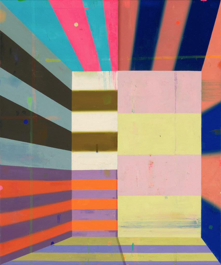
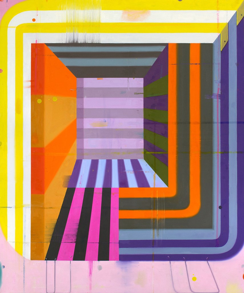
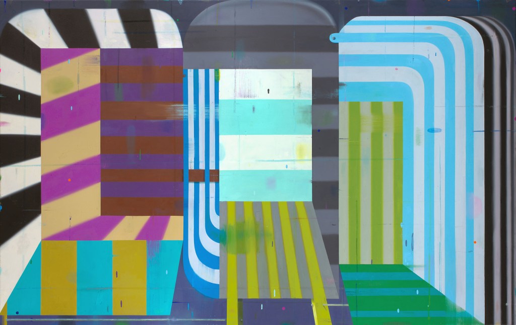
Deborah Zlotsky’s paintings are full of adamant chromatic contrast. She mixes a wide range of specific colors: mustard yellows, orangey russets, dulled violets, chromatic grays, and off blacks. She is the only artist in the group who uses fluorescent pigments, and her paintings conjure construction sites and warning signage. Circus tents also come to mind: well-worn canopies at scrappy regional fairs, shiny new ones not so much. Zlotsky renders stripes in flat swaths, interrupted by spatters, drips, oozes, and swipes. Her surfaces are tactile and look almost weathered. In Tragedy Plus Time, blurs, ellipses, and stylized curves suggest digital imagery, while scattered blips and drops of paint confirm that the painting is handmade. Some paintings contain trompe l’oeil elements that look like ropes, cords, or schematic dropped shadows. These nearly illusionistic details offer a slight jolt on straightforward surfaces.
Zlotsky’s planes, angles, and curves indicate form and space. Several works play with the conventions of representing volume. Inside Out 1 can be read as a graphic perspectival cube. In Near and Far 15, one plane points to a certain spatial reading, then the next plane contradicts it. In Holding Pattern, the largest of her paintings here, there is a central doorway-like rectangle with a projecting pathway, surrounded by other planes, varying in scale, that push outward. Walking into that doorway, you’d need to stand aside to avoid being mowed down. Zlotsky’s paintings are inviting and can also be spiky.

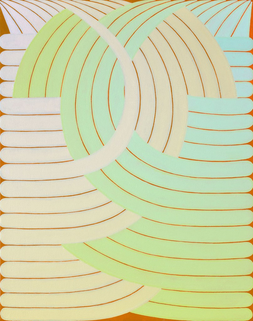
Audrey Stone works with restrained palettes of two or three hues, painted in thin strips that gradually modulate from very dark to very light. Stone’s surfaces are meticulously painted but still breathe, due in part to slight rippling irregularities in the dark-light sequences. Value contrasts at edges make for a fluting effect up close. Stone’s finely stepped gradients produce blurs, atmospheres, sometimes a sense of movement. And they pointedly evoke light. No Horizon / Lilac Haze suggests a twilight landscape, divided by a flutter rather than a clear edge. Open Promise moves from full hues on one side of each panel to near-white on the other, suggesting the glow of an incandescent tube. Ghost Song has a similar palette, but the greens and blues are interior and small, surrounded by modulated expanses of gray, yielding gentle hollows and pearly luster.
Like all Stone’s larger works, Open, Open is a modular diptych, in an arrangement derived from myriad symmetrical pairings in her studio – mirrored, stacked, inverted. (She may rearrange the panels of a given painting yet again in a future installation.) It looks nearly monochrome, dominated by cool viridian green. With this minimal palette, Stone creates drama, partly by introducing a complementary hue in minute amounts. The deep blue-green gives way to a slightly pinkish gray, and the painting’s dark center recedes inward to an inky, cavernous depth.
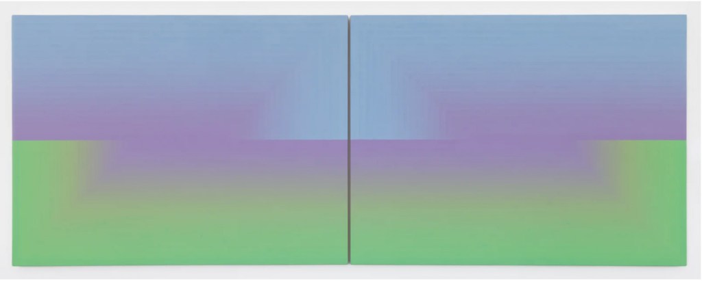
Photo Courtesy of Andrew Schwartz.
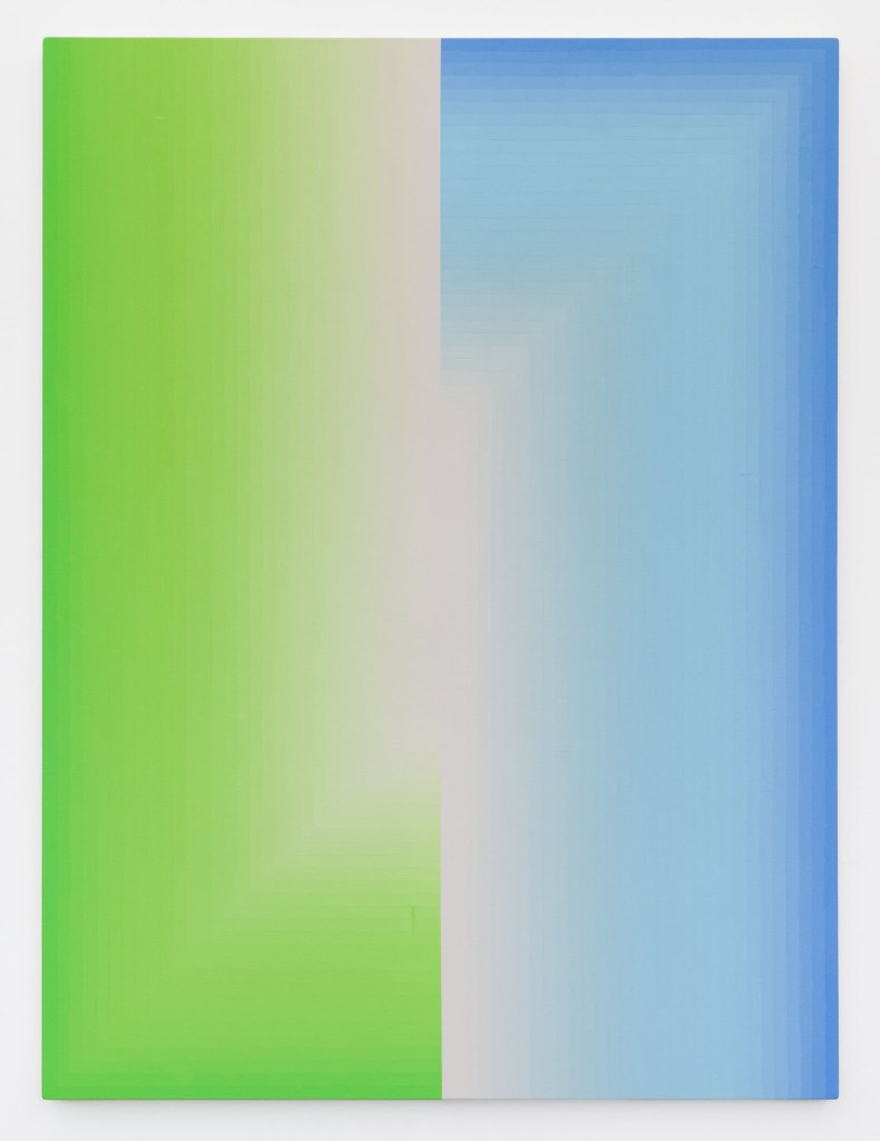
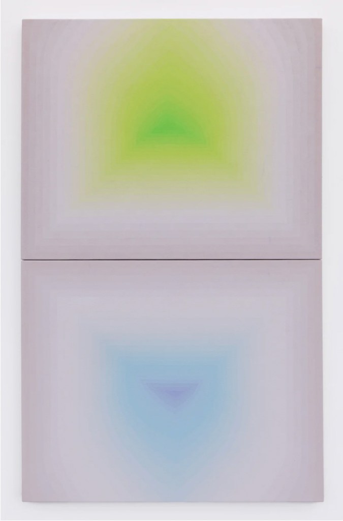
Photo Courtesy of Andrew Schwartz.
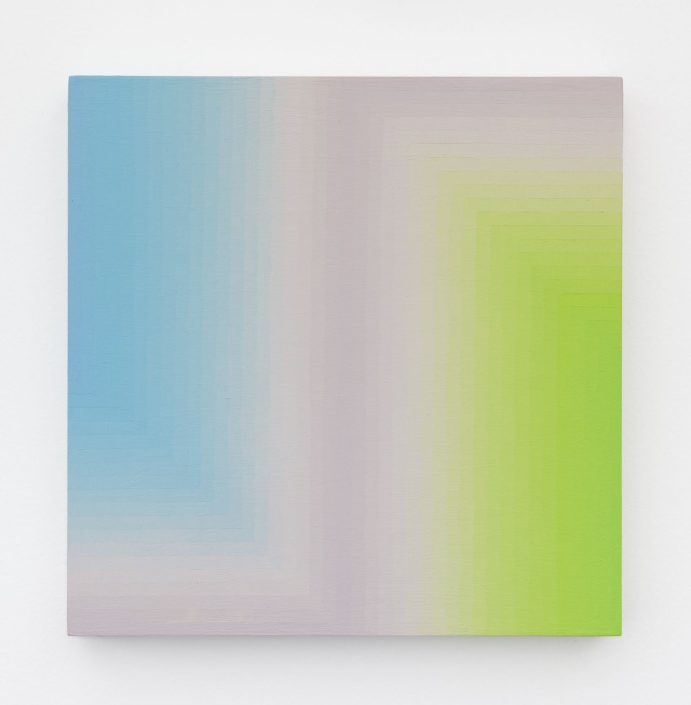
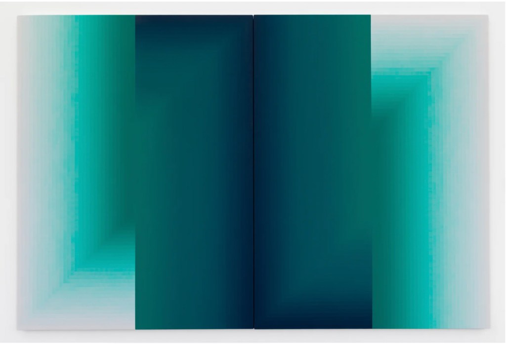
Photo Courtesy of Andrew Schwartz.
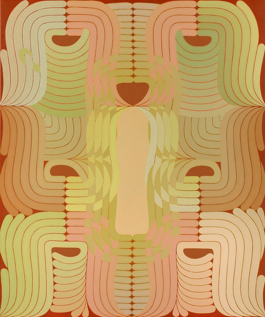
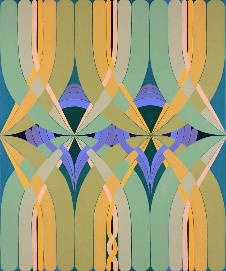
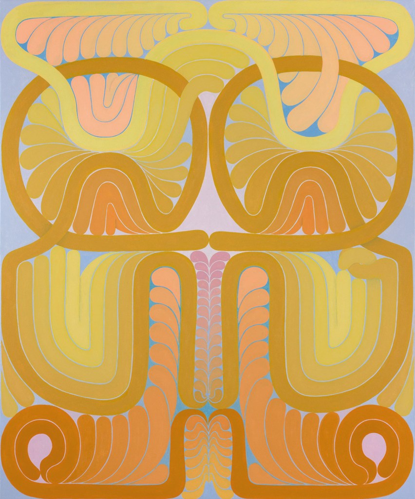
Jenny Kemp’s seductive paintings, dominated by subtle light colors, emphasize smoothly arcing parallel bands, combed and interwoven in celebratory flourishes. Larger canvases like Pinwheel have overall symmetry interrupted by small animating irregularities in color and shape. Kemp’s enlaced, spiraling, arabesque configurations can resemble heraldry, or diagrams of knots, or close-up views of natural forms such as feathers and insect wings. The pattern-like structures of Reverb and Duo also suggest ornament ranging from Egyptian reliefs, to the Wiener Werkstätte, to Art Deco.
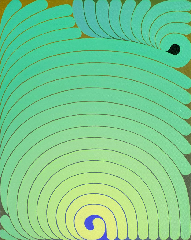
Separating the bands undulating through Kemp’s paintings are thin contrasting lines that can thicken into small shapes, as in Untitled (Thrum) 4. On inspection, the lines are glimpses of darker underlying fields that shift in hue but remain consistent in value across the surface. Meanwhile, the hues of the lighter strips move from warmer to cooler. In Untitled (Thrum) 4, the ground changes from olive to ultramarine, while bands progress, through gradual intermixtures, from pale cerulean blue to acid yellow-green. In each painting, the opposing gradients create a soft glow that’s almost metallic but not quite tangible.
By juxtaposing these related but distinct colorists, the show demonstrated the range of territory that abstract painting can evoke or evade. Zlotsky’s work is material, architectural, and urban. Stone’s reads as light, shadow, and space. While Kemp’s paintings summon a range of historical and natural references, and have a satiny sheen, their substance is ambiguous. The show was a sharp reminder that, while color in abstract painting can parallel our experience of the world, it offers an experience that’s not an imitation of anything else.
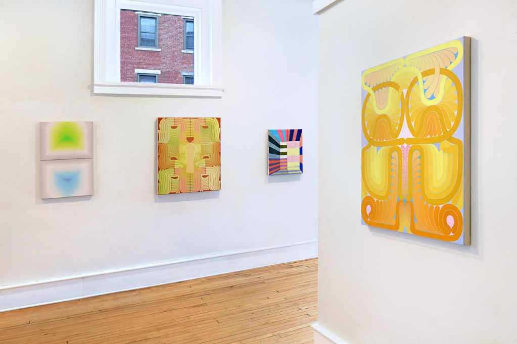
“Polychrome,” Bernay Fine Art, 296 Main Street, Great Barrington, MA. Closed August 12, 2026.
About the author: Leslie Roberts is a Brooklyn-based artist and professor emerita at Pratt Institute. She had recent shows at Studio Light | Space in Tucson and 57W57Arts in New York City.