
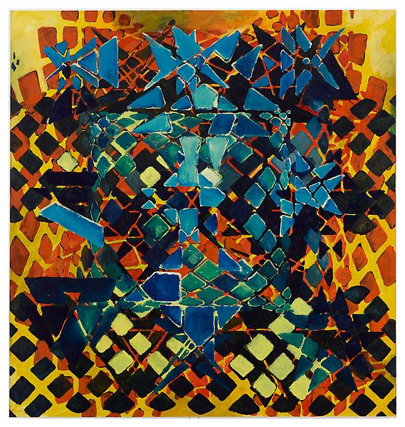
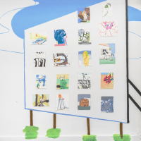
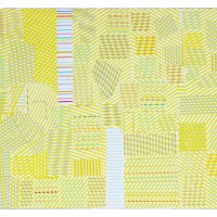
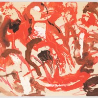
Ken Johnson at the NYTimes called Terry Winters’s new paintings at Matthew Marks both gorgeous and ravishing, but after seeing the show yesterday, I have to agree with David Brody’s terrific review at artcritical that Winters’s use of color, for all its vivid exuberance, is lackluster and his paint handling equally disengaged. In the 80s and 90s, Winters’s influential paintings featured a limited palette (dominant colors: gray and other seductive neutrals) and scientific imagery. The image choice has never seemed all that important to his work, because he’s primarily interested in materiality– what can he do with paint. In his last few shows, Winters has been thinking about color and trying to expand his range, but he’s not a natural colorist. Putting this post together, I realized that these super large canvases look pretty good in the jpeg format, but on the wall, there’s an all too obvious lack of focus in terms of paint handling and color mixing. In his notebook pages, which feature collages comprising color charts and transparent color overlays, Winters’s yearning to understand color is palpable. Not many artists of Winters’s caliber are willing to risk learning out loud, and for that alone, this show is worth seeing.


Related posts:
Talking with Terry Winters
Terry Winters: Haltingly optimistic
——-
Subscribe to Two Coats of Paint by email.


Really interesting take on this show, I too found myself saying "Yeah, but….." for the first time ever at a Winters show. I must, however, disagree with your assessment of the historical nature of Mr. Winters' work. Once he shifted, in the early 90's, from the organic, botanical imagery, to the grid based, mathematical imagery, he started to push his palate far from out of the neutral range. And while I agree that his color choices have always been hard, I find them to brilliant in their emotional discordance. I also think that his choice of imagery HAS been central to his work, if only for his exploration of visual, illusionistic depth. He has described his imagery as "a hypothetical natural history", which I still think is a fascinating way to approach abstraction, almost like a abstract painters version of surrealism. Thanks for the blog, it is aways my first stop on the web in the morning.
"Learning out loud"–well said
Steven– Thanks for reading and adding a few thoughts to the dialogue. Yes, I agree that, visually, the choice of imagery is central, but it's not as important conceptually.
bottom line…mediocre paintings at best. Seen it before, and it's hardly worth talkingabout. Besides he's Winter's, he doesn't need a critique. The work will sell no matter what anyone says. But if this work was made by anyone other than Winter's, it would be a tough sell.
Better than his last show.