In The Independent Claire Dwyer Hoggs talks to Chris Rothko, Mark Rothko‘s son and editor of The Artist’s Reality: Philosophies of Art, a new book of his father’s writing. “‘People imagine my father had a glamorous existence, but he lived mainly in slums,’ Christopher says, as he settles into his chair. Mark Rothko’s best-known paintings now sell for tens of millions of pounds, but during the Great Depression he lived hand-to-mouth, and until the last two decades of his life � which he ended with a razor blade, in his studio, early one morning in 1970 when Christopher was six � was largely unrecognized and unsupported by the art establishment. The artist’s 45-year-old son is a psychologist, but has for the past eight years looked after the Rothko Family Collection and Archive with his older sister, Kate. Rothko’s prolific body of work, mostly produced before people began to think of him as an artist of note, was often done at night, after a day of teaching, and at weekends. Part of the tragedy of his career was that he spent a lifetime struggling for recognition, then struggled to deal with it when he achieved it. ‘I don’t think he ever fully came to grips with it,’ Christopher smiles. ‘As soon as he became successful he began to suspect it, that maybe the painting was too easy because so many people liked it.'” Read more.In The Guardian Adrian Searle reports that the Tate Modern’s Rothko retrospective, on view through January, is a great show because it focuses on the materiality rather than the spirituality of Rothko’s work. “Rothko was a painter, not a religion, and the curator, Achim Borchardt-Hume, has made an effort to rescue Rothko from his fans – even, perhaps, from himself….The show makes a careful study of Rothko’s technique, his materials and paint application. One painting, owned by the Tate, is shown alongside close-up photographs of details seen under ultraviolet light, revealing the complex layerings and reworkings the artist subjected his work to. The painting is displayed on a false wall, with an aperture behind that enables us to see the back of the canvas. With their plum and red grounds, their orange and russet and grey and brownish hovering forms, the Seagram paintings always risked being taken for an overly tasteful colour scheme. Their mutedness can seem a kind of deluxe sumptuousness, to offset the brownish tinted windows of the Seagram building. On a bad day, and to an unsympathetic eye, Rothko can look cheap rather than deep. But he was also an intensely dissatisfied artist, who at his best pushed his paintings beyond his innate taste. He kept on working until the works became unfamiliar to him, as awkward in the world as he probably felt in his own skin. For all their premeditation, Rothko’s approach to the Seagram paintings is often revealed in blunt and even slapdash touches and swipes of his house-painter’s brush.” Read more.
 Award-winning NYC blogazine with a focus on painting
Friday, May 15, 2026
Award-winning NYC blogazine with a focus on painting
Friday, May 15, 2026


Recent Posts
 At the gallery with Olivia Drusin May 14, 2026
 Louisa Chase: Painting psychic riskMay 14, 2026
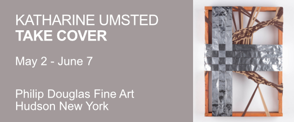
 Katherine Umsted: Anything but seamlessMay 7, 2026
 Maureen Dougherty’s collectors: Pride without greedMay 7, 2026
 Anke Weyer: Flying freeMay 6, 2026
 Bodies of work: The human figure as cultural constantMay 6, 2026
 Sharon’s Substack / May 1, 2026May 4, 2026
 Joan Semmel’s simple truthMay 3, 2026
 NYC Selected Gallery Guide, May 2026May 1, 2026
 Hudson Valley (+ Vicinity) Selected Gallery Guide, May 2026May 1, 2026
 The Nihonga avant-garde’s cultural outreachApril 29, 2026
 Emily Kraus: Balancing control and surrenderApril 29, 2026


×
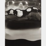
Rothko is miles apart from the rest. He is as abstract as they are, but his paintings are captivating in a strange way.
His own explanations are somewhat beyond my horizons, and I would not want to sit for any length of time in that room that he called "a chapel", but his earlier works, those white, pink, red, orange and bluish rectangles, they do look like apparitions from outer space. Compared to that, Motherwell for instance is a statement of intention rather like a traffic sign