
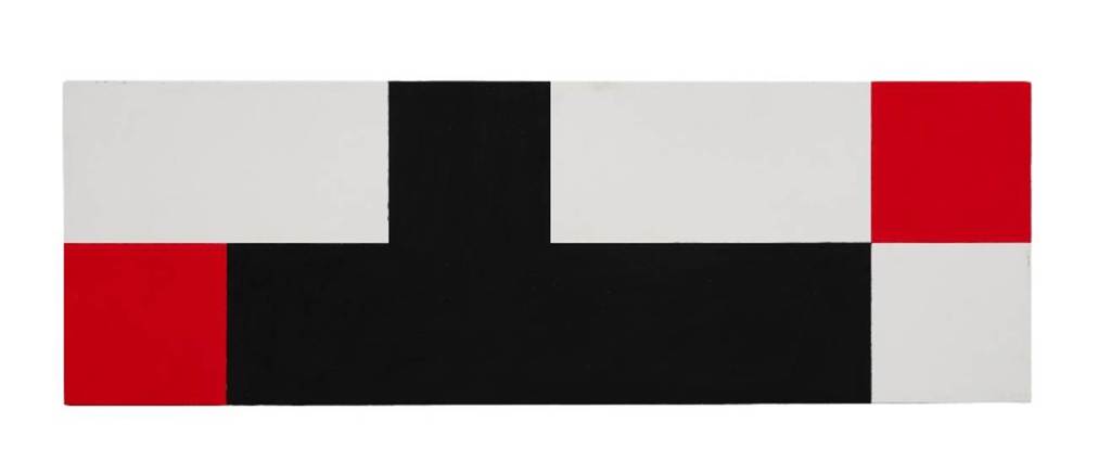
Contributed by Marjorie Welish / Robert Storr’s canvases are designed to counter expectations and require us to discard habitual taste. Disequilibrium reigns in abstract compositions exploiting the inexhaustible potential of the basic unit of the square. To keep the viewer alert, he employs novel moves and tactics, inserting an eye-catching red block within otherwise black and white interlocking compositions. But Storr’s paintings, on view at Vito Schnabel through January 17, are not about color, or even about perception and finesse bestowed to a surface. Rather, color for him is a signal to attend to a structural remit for composition.
Please click here to contribute to the Two Coats of Paint year-end fund drive

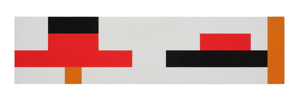
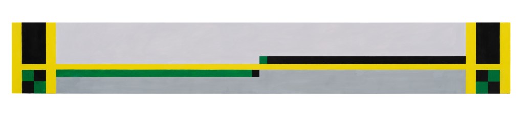
As the exhibition proceeds, the compositions become more complicated. Internal framing devices suggest ground plans, dividing and subdividing, sometimes importing a decorative color palette – the very thing excluded from severe red, black, and white of the main body of work – with facture plentifully in evidence. Increasing the number of variables, of course, puts structural rigor at risk: some compositions seem tentative, like hypotheses held in suspension.
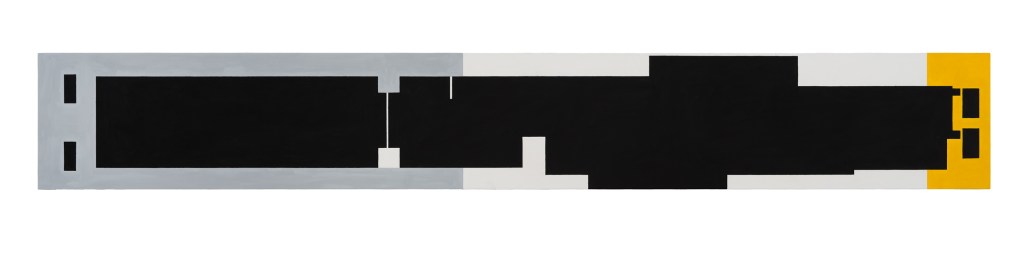
In a campaign in a veritable field of operations, the dominance of margin versus center is continually reassessed. This is evident in the proportions of canvases stretched out to disturb fixed ratios off the square – 1/3, 1/4, 1/5, 1/7, and longer. Horizontally oriented on the wall, long, narrow edges are marked with squares, lines dividing the center top from bottom. Thus unsettled, the center is at odds with itself. The formalism applied here involves dashing expectations of proportional space and structural resolution by way of a forceful rhythmic discontinuity.
Art historically, Storr’s paintings brush up against De Stijl, reflecting the dialectic push and pull of argument. Employing square and line to explore the aesthetic potential of positive and negative space, De Stijl arose from a compulsion to construct a world of complex simultaneity at the end of the First World War. There is still much left to investigate within its assumptions about spatiality. But Storr brings to the table a surprising openness to reassessing the ground, to the point of taking on an alternative aesthetic in full view. He has produced a body of work that admirably inspires critical thought.
“Robert Storr: Fits and Starts,” Vito Schnabel Gallery, 455 West 19th Street, New York, NY. Through January 24, 2026.
About the author: Marjorie Welish is a New York-based painter and art critic. Her most recent solo exhibitions were at The Flow Chart Foundation in Hudson, New York, and Jesus College, University of Cambridge.


Rob Storr’s show is wonderful. It does inspire critical thought in surprising ways. Thank you Marjorie Wellish and Two Coats of Paint for the review.