

Contributed by Debbi Kenote and Tyl Will / Bushwick Open Studios 2016 erupted with color this year. Saturated gallery walls and odd street happenings drew crowds inside and out. Bogart Street and Johnson Avenue boasted full spectacle, with street installations and performances spilling out of the surrounding buildings. As usual, the yearly crawl featured open calls, curated exhibitions, and artist studios, along with pop up vendors and more. Despite the new date (October as opposed to the first weekend in June) and a lousy weather forecast, attendance was high.
Two themes were apparent: the prevalence of neon palettes and plenty of alt-comic imagery, which seems to have crept further from comic-book culture into the realm of high painting. Scribbly gesture and flattened forms evoked the nostalgia of middle-school doodling. In addition, exhibitions and studios were rife with landscape painting, with flattened and distorted perspective throughout. Overall, abstract painting seems to have arrived someplace new–the land of narrative and neon.
Part One: Tyl Will’s picks

The first object of interest was a little painting by Christophe Robe that seemed very quick and playful, similar to something that could be found in Jordy van den Nieuwendijk‘s sketchbook. This goofy painting was electric; both depth and flatness created tension. It seemed to be both landscape and non-objective, built of concocted shapes with marks of maddening spontaneity.

Down the hall at Honey Ramka, I found a couple of hallucinatory paintings by Clayton Schiff. They had an acid-jungle-videogame-map thing going on. I think he has taken Jason Galea‘s psychedelic aesthetic down a fascinating Guston-esque path (King Gizzard album art). Schiff’s perspective is a clever combination of bird’s eye and side profile, a distortion of being above and beside something at the same time.

At David & Schweitzer Annex I spotted a bold series of Sean Greene paintings that reminded me of Jonathan Lasker‘s playful linework. A nice amount of depth broke through flattened shapes. Staring in, I was suddenly immersed in a universe of 1970’s Italian furniture design (picture Ettore Sottsass). I was struck by the compositional awkwardness–maybe it had to do with the imbalance of circles against squares, or maybe it had to do with the subdued middle ground palette sandwiched between loud colors.
At Clearing we saw the show that has been making an appearance online in the last couple of weeks: “Were Good Men” by Calvin Marcus. Here, the alt-comic influence was strong. Mutilated, disproportionate corpses of decorated soldiers seemed to be bleeding out in the silliest ways possible, with long tongues out and eyes askew. The panoramic installation of thirty-nine nine-foot tall canvases transformed the space into pages of a giant storybook. Whether intentional or not, their close proximity and linear arrangement suggested an ongoing narrative. So what does this whole comics-in-high-art tell us? Certainly some kind of heroic boyhood fantasy is at play.


A stunning Harold Ancart in the back gallery bolstered our discussion about the prevalence of zine culture in contemporary painting. The images are built with blobby, hard-edged blocks of color read like color plates from a serigraph.
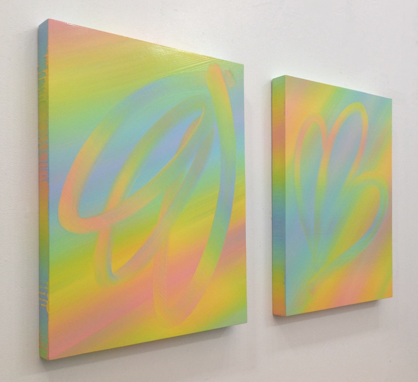
In the open studios at 1717 Troutman, I met Aliza Morell, whose prismatic oil paintings screamed about their innovative process. Like Bernard Frize, Morell has figured out mysterious ways to apply paint that make the viewer puzzle over how they were made. Meeting a painter whose practice concerns experimental mark-making was refreshing.
Part 2: Debbi Kenote’s thoughts

The navigation of color and line pull the viewer into Jeanne Tremel‘s small-scale paintings. In Tweeking Place, a mixture of elegant and messy marks mix together, conjuring the magic of ice cream melting. The size and title refer to Tremel’s recent move from a Bushwick studio into a small apartment workspace, a change that highlights the lack of affordable space for artists in NYC. Tweeking Place is a play on “Seeking Space,” the title of the exhibition, brought to us by David & Schweitzer Contemporary.

Also at David & Schweitzer I found an ink drawing on paper made by Alison Causer. Although small and low to the ground, it was impossible to overlook. In the salon-style exhibition of mostly colorful works, the minimal imagery and desaturated palette stood out. The composition was dominated by gestural lines that constructed a vaguely cartoonish baroque underpainting
Later in the day I met a fellow West Coast transplant Kate Liebman. In her studio I found some of the largest, most stunning paintings I had seen all day. Located at 1717 Troutman, her studio was a resting place from the craze of fully-saturated imagery that seemed to be leaking out of every corner this weekend. At times bright, but also at times dull, the content of the work felt personal. Liebman stitches together� the canvas before she stretches it, giving the paintings a quilt-like feel, but the imagery speaks of an aerial view of landscape. The paintings of another West Coast artist, Rebecca Morris, came to mind.

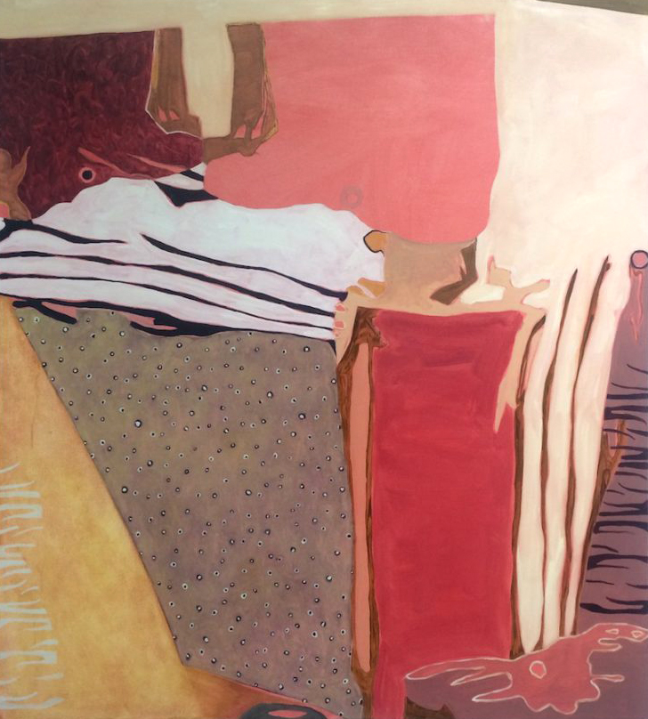
Across from Clearing, up and down Johnson and Morgan, I wandered through unmarked doors and discovered more bodies of work. The further I got from neighborhood hot spots, the more the neon seemed to dissipate. On my return back down one hallway, I found a door that hadn’t been opened before. Peaking in, I saw blue forms on canvas, undulating and twisting in and out of space, not unlike Picasso’s Guernica. Artist Roman Crochet returned from the bathroom and shyly told me his studio was closed, but agreed to let me in to look a little longer. He wouldn’t let me take photographs, but encouraged grabbing an image from his website instead (image above).

At the Parlour Bushwick the owners gave us a warm welcome. I fell into conversation with Rachel Phillips, whose studio is above the apartment gallery. We discussed the loose narrative in her work, in which colorful motifs appear, with occasional references to memories from childhood and persistent brain musings manifested as geometric shapes. The bright paintings hold darker content as well — Philips discussed the recurring anger that appeared in the work. With titles such as Who Said I Wasn’t Angry (featured above), her use of bright colors adds a layer of complexity to the stories she tells and the moods behind them.
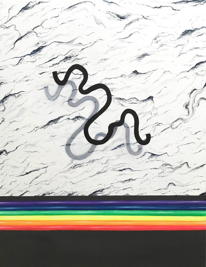
Our Bushwick Open Studios concluded with “Beauty Palace,” a group show at 1263 Bushwick Ave, curated by Kat Ryals. With the ambiance of space-age bleeps and bloops from Nick Demopoulos’s hand made instruments, we found a painting by Charles Sommer that featured a fully saturated rainbow running across the bottom. It seemed to solidify our analysis of BOS2016. Like Morell’s soft neon works above, process is an important part of Sommer’s work. He begins with a small collage, then carefully enlarges the image into a painting. The spacing in Untitled also evokes the presence of narrative – the bar at the bottom feels like the division of a page in a book. And, lastly, one cannot help but notice the flattening of landscape, produced by the simple shadowing of a squiggle.
——
About the authors: Debbi Kenote is an artist, writer and West Coast transplant. She received her MFA from Brooklyn College in 2016. Tyl (till) Will is an artist, writer, curator, and gallery director. They are co-founders of a new blog called Open House.
Related posts:
The strategic now (MoMA’s 2014 painting survey)
Peter Halley: Hyperreal
A short line drawn between sex appeal and a retinal overload gross out
Ben Godward’s exploded view


I am always charmed by Two Coats of Paint’s posts, and this one in particular. Nice and fair takes on each artist, although I’m surprised that the similarity to Carrol Dunham’s work wasn’t touched upon regarding the Christophe Robe painting. Clayton Schiff’s work has me wanting to see more ( maybe Pinterest?) as well as Alison Causer( would like to see more of this) thanks for existing.