
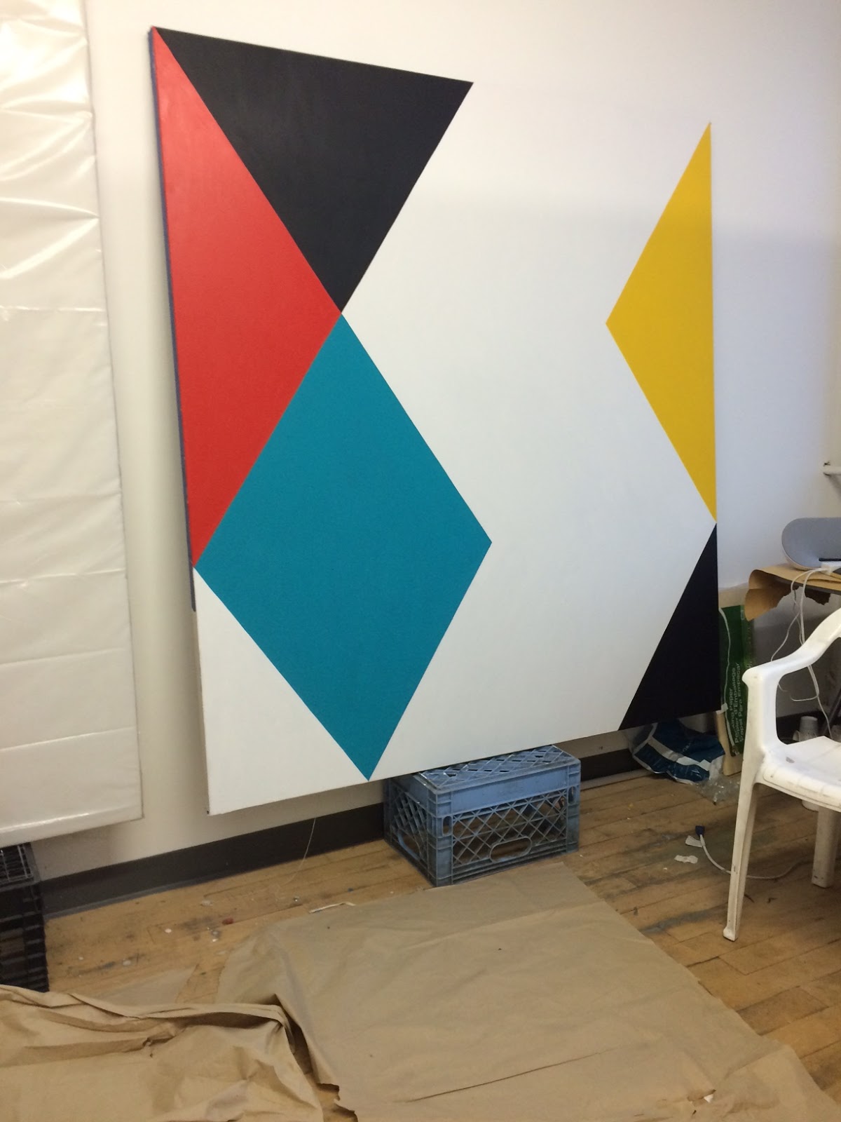
Contributed by Rob Kaiser-Schatzlein / On a rainy day in November I visited Stephen Westfall at his Brooklyn studio. Among my young painter friends he has a reputation for being open, generous, and extremely smart, but I was still a little nervous. He warned me in advance that most of his work had been shipped to New Mexico for an exhibition over the summer and that only one painting was left in the studio. Nonetheless, when I got there, that single painting seemed to fill the whole room. His paintings comprise flat color organized in geometric shapes, replete with straight lines. The paint covers the canvas from edge to edge, and the highly saturated colors create a multiplicity of rhythms and tempos. Ultimately, the work seems playful but serious at the same time. We sat down and discussed his recent work, his friends, and his influences.

Rob Kaiser-Schatzlein: How do you start a painting?
Stephen Westfall: The difficulty in that question�and what�s true for most veteran painters; I’m old enough now where veteran is a nice way to put it�is that we are not starting paintings, we’re establishing an ongoing vocabulary that is sort of morphing. Each painting is not a stand-alone, as it would be for say, a landscape painter: over here I’m looking at the city, over here I’m looking at the country, over here I’m looking at the beach and that is not the city.
You could just tell me the material beginnings, if you like.
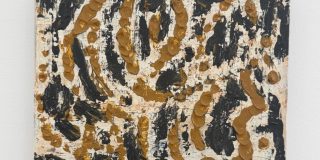
Right, well I start with a drawing. A sequence or constellation of several variations on an idea about a pattern that is geometrically clear and locked into the borders of the canvas, even when it doesn’t appear to be. A lot of work is about making it not appear like it is locked in. However with tools like Photoshop, you can fix this point of measurement before you make the drawing. I still have to do everything by hand though. I don’t use tape. Some people call me a hard-edge painter, but the only time I use tape is on the giant wall paintings, because you have to. But on the canvases it’s all hand drawn and hand painted, the paint meets the paint. I mix my paint up in large volumes in paper coffee cups; it’s almost like a small can of paint. Every color keeps evolving because it’s basic variations on my own flavor of primary and secondary and then maybe a light or dark in some colors like blue. Particularly blue. All the colors are cross-mixed with a touch of the complement of that color and a touch of white to add opacity. That is coming out of Post-Impressionism and early Expressionist and Fauvist painting. Starting with late Impressionism distilled with Mondrian-meets-Stuart Davis-meets-Ellsworth Kelly. There’s a real sense in my painting that I’m having a conversation with Abstraction, Minimalism, and Pop. And memory� there�s the question of how can an abstract painting have memory. Over the course of a century, it builds a memory. It’s like having a conversation about painting, but not having its nostalgic invocation. It acknowledges that abstract painting is now a thing. So, paintings are not originary for me.

What do you mean by that?
Like this painting, I make the drawing; an idea of pattern evolves that I have associations with, even though it is a very abstract pattern. Years ago I was known for broken grids, with twisted interstices. There was a kind of shimmy that ran through it. Basically the harlequin pattern is itself a part of a grid but I wanted the movement of the diagonal, and now they’re much jazzier by leaving larger areas of white, or color.
So I’ve got the colors mixed up, I have a pencil, I have a big ruler, I know where the points are and I make the drawing. Then I look at the canvas and I can see it, because paintings come to me whole. Even when I was painting more singular images, I would dream them. I don’t know why this is, it just is. It�s partly because I see paintings in real space, real architectural space. I don’t see the studio as the place where the painting is finished; I see it finished in the place where it is installed. So I start the painting with the drawing, and then I make initials in the area where the color is going to go.
And then the color just goes in, it’s as dumb as Stella was doing with his stripes. That’s just the beginning, though, because you have to get a certain surface. It takes as many as eight coats of paint, and the colors subtly shift. I have a hard time getting the right concert of flavor with the color. All these colors are named: white, yellow, light blue, black, red but there are little cross mixes and compliments. That doesn’t mean the yellow itself isn�t going to be too cold, too warm and need adjustment–it’s rarely too warm but my whole taste leads to warmth.
The white has mixtures of red, yellow, and blue in it, the red a little chromium green oxide in it plus maybe some yellow ochre, the yellow is a mixture of cad yellow light and yellow ochre and Williamsburg Provence violet red, again the warmth. The black is Ivory Black but also a black I make with Ultramarine Blue, Van Dyke Brown and Payne’s grey. What�s happens is that you have all the colors in all the colors, reflecting. Even the cross-mixed colors are colors from cups of previously cross-mixed colors. So the green that I put in the red has a little red�it’s like a sourdough culture.
Backslopping is what they call it in fermentation.
Some of these colors have DNA that goes back years and years and years. One of the most demystifying things I ever read was something on Bill Jensen. He was asking Guy Goodwin, “How do you get all your colors to go together” and Goodwin “Well I just keep all my brushes in the same jar of turpentine.” Well, basically that’s all you have to do. So I don’t start a painting, I start seven paintings, or I insert a painting into a group of paintings that is already in progress as an addendum to a conversation that is already happening. You can even see right here where I was working on designs and stuff [referring to a roll of paper about three feet across and couple feet long that looks like it was inkjet printed with myriad five by five inch designs] and applying those.
They’re like sketches?
Kind of like sketches, but I always switch things up. These were actually done for potential monotypes. And you can imagine how crazy it is to make monotypes in “hard edge.” I just did a whole set for the Brodsky Center. Jeez, that’s another thing I did this year. I’ve been kicking myself for not being in the studio, but I was actually crazy in the studio through May. I am a studio creature basically, so it is unusual for me to be out of it for so long. But I have had alternate things going on, with the wall paintings and monotypes and stuff like that. Anyways, that’s how I start a painting.
You’re saying that it’s not that one painting or one series arises from one idea, but that they all reference a larger idea that guides your work.
Yeah, every three to five years there�s a real break and shift, but that doesn’t mean that what I was doing before that stops. In the overlap there may be another idea. That’s how it’s working right now, but who knows. I’m so amazed how often so many of us can work for years and then suddenly, based on some inspiration or some point of experience, just blow everything up. In part, I think that painters are always looking for an opportunity to keep painting. That�s one of the reasons why we work in series, because it allows us to paint. Because painting itself is an immensely pleasurable thing.
The tools have changed. I sometimes use Photoshop but only for getting a general idea of color distribution. Not shape distribution because that’s already inherent in the grid. Also Photoshop is just measuring. I can take this whole thing and shift it sideways so that nothing lines up, according to the proportions of the rectangle, and maybe tilt it a little bit so it torques. That’s a really queasy, crazy thing but you don’t know where the points are. So Photoshop will just go like “Oh the points here, and the points here” and this is how many centimeters or how many inches. Once you have your basic outline you can use your ruler again and do the same intersections.
The broken harlequin grid paintings have an element that is a new development inside this developing language of my painting, which I am looking forward to pursuing. Though right now I am kind of locked in to this sense of torqued space. That�s the space that is straight edged in some sort of way but tilting or careening ever so slightly off the frame. Implying a continuing plane that goes much larger than the frame. The ones with the horizontal lines that I showed you–which I call Reclining Harlequin, which is one of my favorite titles, it’s so stupid–both those paintings are quite large paintings and this plane is not as locked in as it is here [the painting in the studio], although I really love this painting. This other thing is interesting me too. I think I yearn for a little bit more free-handed stuff. But I don’t know how architecturally decisive that would be.

If it stopped being architecturally decisive would you be less interested?
I don’t know, I just don’t want to veer too close to the lyrical, I’m so lyrical. In general, and I’m deeply suspicious of my motivation for setting up a funny kind of narrative. A painter I really love is Kimber Smith, but then I also really love Blinky Palermo or Mary Heilmann. Mary Heilmann is somewhere between Kimber Smith and Blinky Palermo in a funny way.
How do you know when you’re done?
When there is a kind of creaminess to the light and to the way the colors are fitting together. Which also corresponds to a fullness of surface. And that’s when I know I’m done.
You start looking for it when you are around eight coats?
I start looking for it when I’m at three, knowing that it’s not going to happen until at least five and at eight I’m tearing my hair out. But I’m also listening to really good music on my iPod and having good coffee from downstairs. I have three studios that are all about the same size. This studio is dedicated to the larger painting. There’s a studio at my loft which I’m using for gouache and small paintings and then there�s a studio upstate in my little country cottage near Bard, but I’m only up there in the summer time. I don’t have a baronial castle like Baselitz. The work is kind of divided from itself. But I’m usually pretty good at retaining the tactile memory of what’s happening from one place to another.
Like an organ transplant currier, ferrying ideas between venues.
Yeah, packing the little paintings on ice and to bring them to the studio where the big paintings are and graft the idea on.
When’s the best time to work?
I tend to work late at night because there’s just less distractions. During the day I want to be out looking at work and I want to be in daylight. Probably like anyone else with seasonal affective disorder. But when it’s crunch time I’m happy to be working around the clock. When I was in Rome making a show at the Academy of wall paintings and canvases I worked around the clock for a week, basically in my pajamas on the scaffold at seven in the morning, having not going to bed the night before.
So whatever it takes.
Whatever it takes, but I’m getting older and I am appreciating the value of working more in daylight. Then there�s also school. I teach at Rutgers during the year and Bard during the summer. Doing a little less at Bard, I’ve been there a very long time but still I’m very committed to my students. So, like any family man I have to work around things.
Anyways, night is better because it’s quieter but it also has its disadvantages because you turn into a zombie after a while. I mean, everybody should be in bed by one.
What�s most recent painting that you’ve done?
This year I�ve done something like eight or nine shows, so that’s why there’s only one painting here right now. And it’s part of a series that came out of a giant wall painting I did two years ago for Art OMI.
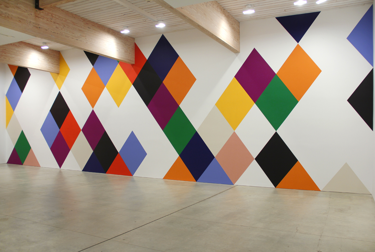
The most recent stuff has been on many material fronts: paintings, wall paintings, textiles, accordion books, and some things that have ended up being sculpture. Obviously I’m a lifer as a painter, but since 2007 I’ve been doing wall paintings, which sort of puts architecture into material play. And I�ve always been interested in how painting interacts with architecture.
I’ve been doing these Harlequin diamonds [showing me pictures of a wall painting on his iPhone]. This is from a show of paintings I had up at Art OMI two summers ago. What I did for the first time was to open up spaces in the Harlequin grid. Now instead of a forty-five foot wall painting, this painting is part of a series where I’ve done the same thing.
Is this painting based on a section of the wall painting?
No no, it’s based on the idea of opening up the white space. It turns out that it does really interesting things. The white space becomes quite figurative, rather like Cezanne’s bathers or Matisse’s Dancers in the Barnes Mural. They are in a show right now in Santa Fe and these will be part of my show at Lennon Weinberg. This painting in the studio is part of that group.
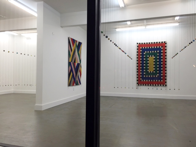
These were all in the studio up until May, when they got shipped out to New Mexico. I’m also doing tapestries and rugs–they�re in this show at The Suburban [showing me pictures on his phone] with Polly Apfelbaum’s ceramic beads. We just installed it, and it’s a stunningly beautiful show. Polly and I are old friends; we set each other off in this interesting way. Since ’82 we’ve been calling each other then emailing each other then texting each other like three times a day, like “Have you seen this? Have you seen this?” and I am not exaggerating. I think that part of it is that we�re both interested in a sensate semiotics of visual components. Meaning things that are like signs but are not language, they lean back toward the visual, the perceptual, the phenomenological. And indexical color and the indexing of materials in some way. So color as tactile color. Once you register color as tactile you register it through other senses, like taste.
Indexical in what way?
Like a making a chart. Primary, secondary, and hitting those points, kind of a like diagram. Then having it being so much more than that. Coming back to the specificity of sensual experience, so the diagram is only a model and something that is absolutely integral to being inside the body that happens in the perception. Polly is a sculptor of fabric, found objects and I’m more of painter of a rectangle in the studio. But we both think a lot about architecture too. Her husband is the architect Stan Allen.
And you always have.
Yeah, and world literature. But world literature that is say, meta. It’s just an endless sharing of enthusiasms.
How long do the paintings take?
They take months. Sometimes they take a year. I work on many at once, and different colors dry at different speeds. I’ve noticed the cadmium reds take much longer to dry, for instance.
Do they all have to finish at once?
No, they’re all sort of lifted out of the slipstream. This is a year where everything got lifted out all at once because of the quantity of calls that I was answering. Something that is really critical in these paintings is that the paint touches the paint, so that there’s no trough of fetishized trench space between one color and the next. They’re flat next to each other. With oil paint and no tape. I use sable brushes and it is a slow sensual process. There is also a lot of preparation before the painting process even starts. Just even in terms of preparing the surface.
What’s a compositional problem you remember resolving?
Well, what to do with corners and what to do with some of the colors going there. For instance this painting has black on the lower right, which is an Arnheim-ian no-no because optically you feel this heavy weight pulling you down. I had to counterweight it with a lot of lightness in the two-thirds upper center quadrant. The heavier counterweight is up near the top on the left. It has to do with a question of reading the painting. Even in cultures where you read right to left, pictures are read left to right. There is a sense that if something is too heavy on the lower right it�s like the sad trombone, you know, “wahmp-wahmp.” And then you have to fight to not make a narrative out of it.
Does it have to be balanced for it to be finished?
No, there has to be a kind of rhythm. Yeah, no, I can�t live with symmetrical balance as it turns out. I went to abstraction from an exposure to abstraction at Agnes Martin‘s retrospective in ’73. That was just at the moment when I was seeing pictures in international art magazines here and there of Blinky Palermo, I was in California at the time. We weren’t even thinking of Blinky in California, he may have already been in New York, but he wasn’t getting written about. Which was part of his disappointment in life. But I was completely turned on by him from one or two pictures I saw in magazines. Again I see paintings as being figures in the space of architecture. Even if they�re abstract they�re still figures. That desire for the figure is still held by the painting.
It’s just not in the painting.
No, the painting is it. Then it breaks down into a funny movement of figures inside. But I have never been able to live with straight balance, straight symmetry. I have all those spectrum things, I’m dyslexic, I have mixed dominance, I have terrible speech problems, and I�m synesthetic. I sometimes wonder if I have an incomplete bicameral mind. What happened was that I loved Agnes Martin so much that for fifteen years after that I refused to paint a grid. Then I painted a grid, and found out I couldn’t. I made a couple gridded watercolors before that and I didn’t like it, it was too even. So I found I couldn’t make an Agnes Martin. For one thing I didn’t want to be responsible for pencil line. I didn’t want to be a lyrical drawer like Paul Klee, whom I love, and was such a big influence on Agnes Martin. Instead of a line, I made a band, so that it had shape value as a bearer of color. But the bands couldn’t be straight because if they were they looked like every bad graduate school minimalist painting from my generation. Nobody�s making those paintings anymore, right? It’s just too meaningless, too dead. It was some kind of appeal to the ancient geometric orders that took itself way too seriously.
What I found was that if I broke the grid and twisted the interstices, and left open spaces in the grid I could get movement in it. In terms of space I was thinking more like Matisse and in terms of color I was thinking like a color field painter. What I got from Blinky Palermo back in the day was a sense of scale. That something could be twelve inches square or six feet square and each of those things could charge an entire room, the space people move around it. They had to be clear to do that though, they had to be so clear you couldn’t take your eyes off of them. You can be clear and be totally ambiguous, and that’s what’s so great about Blinky or Agnes Martin is that they’re all about ambiguity. It�s all about finding spatial relations inside their clarity, that unfold and you can supply whatever narrative you want to that. They’re still associative; think about how much Martin�s paintings are like weather, for instance.

Any other tools you use that I wouldn’t notice?
Well I am making these rugs with a weaver in Oaxaca and making wall paintings interior and exterior with different kinds of paint. You know what? You know what I really love, that is less classic-heroic-artist in the New York School sort of way, is that I’m having more fun painting with gouache on small pieces of paper now than almost anything. I’m making lots of gouaches. I’d like to collect them all and do a show of just those. Because gouache is already premixed to an idea of color that I have always held. I didn’t always do bright color though, I went through a period of looming sort of pale pastels that were a little polluted in this melancholic way, but those were the years when I was drinking, so the romance of all that. Think about Morandi, funny sort of palette, the grays. Most of us go through a “gray” period, like Brice Marden did.
Favorite tactile experience in painting?
I enjoy the whole process, but the only thing that gets me motivated is deadlines and there is nothing that I hate more than deadlines. I love being in the studio. I have two iPod classics each of them has 160 gigs, 28,000 songs. I hit shuffle and it’s like the world�s greatest radio station and I’m just painting. There’s that thing, someone asks someone else when’s the best time to fish and the person says, “Whenever you can get away.” Maybe you’re thinking the best time to fish is five o’clock in the morning, but it’s not because the point of fishing isn’t to catch any fish�it’s something else.
Related posts:
Artists who curate: “Creating opportunities for felicitous constellations”
Last chance: Julian Pretto’s artists, at Minus Space
——
Two Coats of Paint is licensed under a Creative Commons Attribution – Noncommercial-No Derivative Works 3.0 United States License. To use content beyond the scope of this license, permission is required.


Pingback: Stuart Davis: The last painting - Two Coats of Paint