

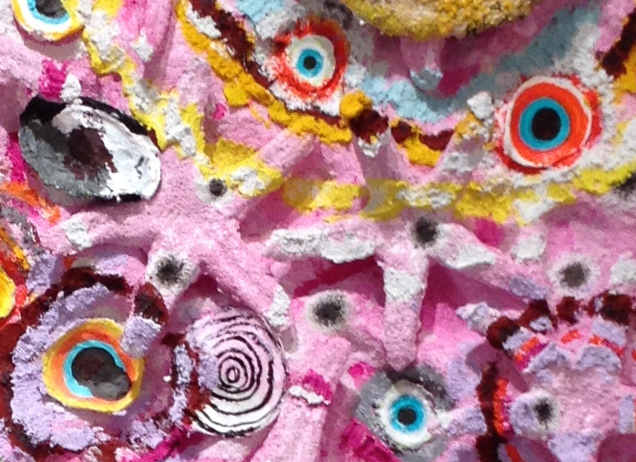
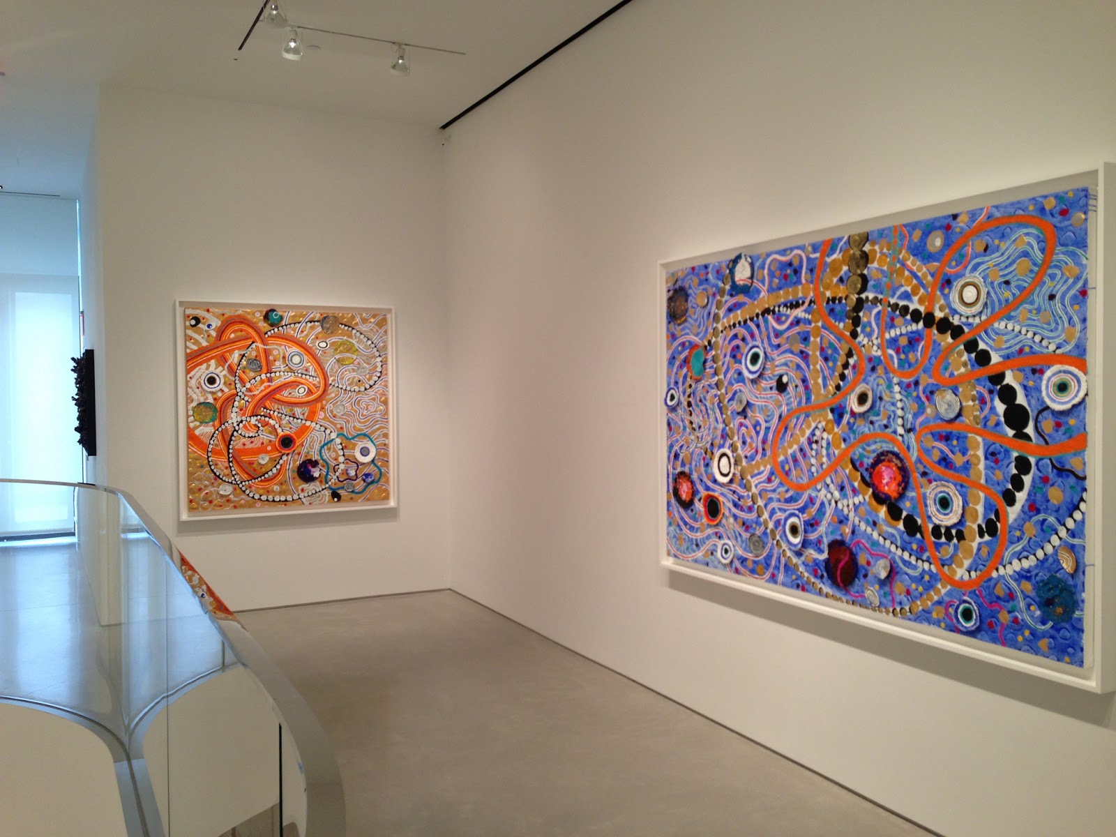
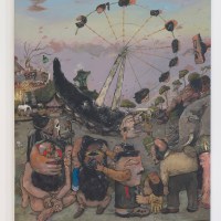
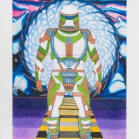
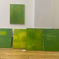
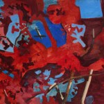
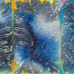
I was taken aback by Nabil Nahas’s recent show of large, crusty abstract paintings at Sperone Westwater last week, particularly the pink one (above) that had starfish forms encrusted in the surface (detail below). According to the press release,
Over the last two decades, Nahas has continuously expanded his methods and materials. In these new paintings, Nahas creates gestural motifs of vivid colors and geometric shapes that cover the three-dimensional surface. The highly textured lines and curves seem to extend beyond the edges of the canvas � suggestive of an expansion of space, of a cosmic universe or macrocosm as well as a microcosm of organic forms.”
The paintings reminded me of Etsy craft projects or those vividly colored Wyland posters of dolphins and whales. For a gallery like Sperone Westwater, they seemed so ingratiatingly lighthearted, I wondered if perhaps Nahas intended irony.
In an interview with Tabitha Piseno at Bomblog, Nahas called the discovery of the starfish form a major breakthrough. The following is an excerpt from the interview.
Nibil Nahas: It happened that I had a house in East Hampton, Long Island, and in 1991 there was this terrible hurricane that swept the island and did quite a bit of damage to the area. I wasn�t too far from the ocean and decided to go for a walk on the beach only to encounter this amazing sight: thousands of sea stars washed up on the sand, it looked like a spangled sky with a sinister touch. I picked a few of them up, took them home, dried them and made my first starfish painting titled EUREKA. I began to realize all the different connotations one can associate with the starfish: It is a naturally structured geometric element occurring in the pentagram shape. Leonardo�s Man, standing arms and legs stretched out, a reference to Vitruvius and the multi cultural aspects of the Renaissance and so on. There were a lot of readings one could have. . . also the relationship to macro/micro phenomena…..
It�s a very rigorous and tedious process. When I first started those pictures, I was using real starfish. Then I was a bit concerned about the permanence of the starfish, and I must confess they didn�t smell very nice. I thought of making acrylic molds of the stars which I proceeded to mount on canvas. The first paintings were saturated monochromatic multiplications of the same natural geometric element. As the surfaces became more loaded with a multicolored mixture of acrylic mixed with pumice, biomorphic repetitive shapes started to appear.
Tabitha Piseno: It�s amazing�even after the molds are painted, they still so closely resemble coral. Do you only use pumice to give the painting texture? Or, do you integrate any other textured materials into the paint?
NN One often wonders how these pictures are made, I�ve heard it all from glued lichen to crumpled paper and so on. No limits to one�s interpretation. . . they are simply painted with a paint brush like a traditional painting. I only use acrylic paint to build my surfaces. The pumice which is very absorbent gives the paint the look of dry pigment and the illusion of fragility, which I like given that process and perception are two of my main concerns. I use golden paints and I recently started using large mica flakes in my acrylic. I had fun.
TP That definitely comes through in the paintings. The inclusion of the mica flakes is new with the starfish is something totally new�you�ve never done this before?
NN No. It is fun, isn�t it?
TP Yes, it is fun!
Nope. Irony-free.
“Nabil Nahas,” Sperone Westwater, Lower East Side, New York, NY. Through May 4, 2013.
——-
Stay in touch: Receive Two Coats of Paint’s DAILY POSTS via email and subscribe to the new WEEKLY UPDATE.


The pink one is incredible! The other ones lack the iconic stature of the pink one, but they are still very nice. I also love your title of "monumental kitsch" – very nice! I am certainly down with the terminology whether it truly applies or not is irrelevant – it makes you think! Thanks for introducing me to the work!