
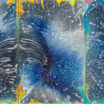
I just got a note from Erik den Breejen, who has a solo booth with DNA gallery at the Untitled Fair in Miami. He included a link to an interesting interview with Jon Lutz at at Daily Operation in which he talks about how he began using text in his paintings and his relationship to music. Here are a few excerpts.
I had been interested in using text for a very long time, but
whenever I�d use it, it would come off like labeling, and wouldn�t
integrate into the picture. About seven years ago, I started making
drawings using a block for each word, with the letters occupying the
negative space. I like that you call it an essential
element, because I see the word block as a kind of cell that makes up
the body of the painting. And of course, the origin of these words is
song lyrics, which I�ve now started forming into images that have to do
with the music in various ways….

I was making drawings of Kiss when I was five or
six, then fantastical drum sets and stage setups in middle school. I
started transcribing lyrics around then too, copying album covers,
making images derived from lyrics. I think a lot of artists around my
age have early work along these lines. Art school kind of taught me
that these things weren�t serious art; that I should learn to respect
things I didn�t understand, like Rothko, for instance. So I did. And
for some time now I�ve been trying to merge the two….I often wonder how my paintings relate to fan art and how I feel about that. I got especially close to that when I did the Dylan portrait because it was such a recognizable image. I
think art world context can help �legitimate� something as serious art,
and there�s always the whole high/low thing, but for me, I am concerned with the history of painting and in dealing with space and color in a serious way. In
the Neil painting, I�m trying to create atmosphere or space through
shifts of color, rather than surface, which is kept relatively even. In others, the more thickly painted, opaque text sits on top of a very washy background to create space. I�m fascinated by the phenomenology of different material combinations like that. Once
I�ve figured out the text I�m using, it becomes very much about all the
painting decisions, and that�s what carries the process and keeps it
interesting, because it can be pretty labor intensive….
.jpg)
Related posts:
Making our post-neo-faux-expressionist-pre-figurative-proto-conceptual heads spin
Jon Lutz and Jim Lee talk in the studio
——-
Subscribe to Two Coats of Paint by email.


are prints available for purchase?