

Contributed by Sharon Butler / Growing up near the Mystic Seaport, I developed a robust appreciation for marine art and wrote several early art history papers on the subject, so trust me when I tell you that the Royal Academy’s “revelation” that society portrait painter John Singer Sargent (1856-1925) painted seascapes isn’t all that surprising. Nonetheless, this summer they’re presenting 80 paintings, drawings and watercolours that Sargent made during his summer trips from Paris to Brittany, Normandy and Capri, as well as two transatlantic voyages. In The Observer Laura Cumming slams the show, declaring that it may be a summer crowd-pleaser, but the lack of sincerity and faint boredom in Singer’s early seascapes foreshadow the shortcomings of his later work.
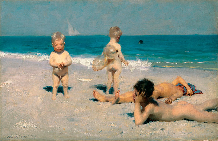
“Sargent’s plein-air spontaneity looks even less persuasive when you look at all the preparatory sketches shown alongside it, figure after figure carefully rehearsed picking his or her way across the beach. In a Monty Python moment, a sketch of a lively little boy gets blocked from view in the final composition by the addition of an absurdly large basket. What was he thinking? The question presents itself over and again. Why was Sargent even drawn to the sea in the first place? He is not interested in being out there in it, like Turner lashing himself to the mast in a storm. He is not interested in being confronted by it, like Monet, grains of sand trapped in the oil paint as he works against the tide, cropping his image so radically the field of vision contains nothing but waves.
“Sargent’s sea is neither experimental nor abstract. It is not liquid and it has no volume or depth. It isn’t numinous or mysterious or unfathomably beautiful. It isn’t even expansive or wild. He seems, in short, to be indifferent to almost all of its obvious qualities, let alone its attractions for an artist. Indeed its pull seems mainly social: a chance to paint chubby little toddlers in water wings, and naked boys flat out on the beach. The latter are smooth, glib, picturesque; the former are sentimental nonsense.
“Which would have been a pretty good reason for leaving them out, except that the case for Sargent as a sea painter would have looked even thinner in terms of figures; as far as art is concerned, it seems his least interesting side. And an unfortunate aspect of this exhibition, given the curators’ eloquent enthusiasm in the catalogue, is that these early paintings only seem to prefigure the shortcomings of Sargent’s worst work: the lack of sincerity, the evasiveness, the faint boredom, the sense that everything is seen, but very little felt.”
“Sargent and the Sea,” Royal Academy of Arts, London. Through Sept. 26, 2010.
About the author: Sharon Butler is a painter and the publisher of Two Coats of Paint.


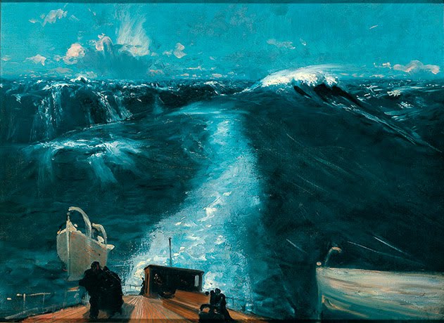
At first glance I felt that the reproduction of "Atlantic Storm" had been Photoshopped, the colors are all wrong, paint doesn't look like that and it makes little sense that Sargent would take such liberties since it works directly against the intended effect. I found another jpeg at the Sargent site which looks mor like I would expect. (Consider swapping out the images)
http://www.johnsingersargent.org/Atlantic-Storm.html
Laura Cumming seems infatuated with the sound of her own voice. Regardless of the relative success of these paintings within Sargent's oeuvre it is valuable to be able to see them if only to become aware that Sargent was in fact human and of course fallible.
Too often we formulate our opinions of an artist based upon a handful of 'signature' works. This is unfortunate for we loose the sense of development and more importantly the oddities within the overall body of work.
Good comment, George. The jpegs are from the Observer/Guardian slide show. I'll try to get some better ones directly from the Royal Academy.
Atlantic Storm (1876) looks pretty wild to me. While Sargent excelled in portraiture and his sentimentality is notorious, his interest in light and color are obvious enough. What I think Cummings misses is his broad and deft brushwork. This is where the artist really gets to grip with 'nature'. Unlike the stippled brushwork of various Impressionists, Sargent pursues an abruptness and immediacy to drawing or modelling, perhaps closer to Manet or Degas, and his patient prepatory sketches only block out composition, allow him the confidence to really model the picture with fluency through a bravura facture.
To ask why he should wish to obscure a carefully worked-out figure with a large basket in the forgeground, is much like wondering why Degas would leave a figure half in or out of the picture frame, why figures often obscure one another, or mask gestures. The object was surely to grasp a moment or motion at a novel or unexpected point, to make us see or experience familiar objects in a fresh way.
Certainly, Sargent has none of Turner's fascination with weather and melodrama. He lived in a different age, for different ideals. He is often accused of being facile. But anyone who has ever copied or tried to paint with his economy and precision will testify, it is far from easy. There is an enormous gulf between laziness and grace.
Where Sargent more seriously fails is in accepting a cosy social circle as adequate for addressing life or nature, on quite the terms his work announces.
Sometimes those that do not make art describe it in such glib terms. I agree with CAP in the assessment of Sargent's remarkable facility with a brush. Looking at an exhibition of paintings, not reproductions, one is able to follow the remarkable pathway that some of his brushwork coursed over surfaces of canvas and paper.
Sargent painted constantly. He was cursed by early success and began to despise the portraits…in downtime he produced watercolors and expected everyone in his entourage to do them as well. His end game was unfortunate…but his technical ability and painterly surfaces are sublime. Forget subject and content and just revel in the superb surface! Go see real art and forget those dreadful jpegs.
Simple photographs could never do Sergent's work justice.
What was she thinking!? To compare Sergent to Turner? It's like suggesting Elvis and Jim Morrison sound similar! They write and perform music, but they are radically different in their approach, and thankfully so!
This proves to me that most art critics should stop studying the canon of art history for a change and actually try painting, and I don't mean watercolours on a Sunday afternoon either.
Only then will they truly understand the formal, tactile, qualities of paint.
I agree with CAP too and absolutely not with the critic. But then again I love Sargent, just about anything he does. Turner could get "bored" too. Would love to see these painings!
Ok then try and copy Mid Ocean. I’ve tried and I can’t. If someone else can do it write an article on how. The colours and brush work is brilliant.
Ok then try and copy Mid Ocean. I’ve tried and I can’t. If someone else can do it write an article on how. The colours and brush work are brilliant.
oh I saw his work at last in Richmond va he is wild and free as a bird the storm painting was my favorite he used his finger for the sweeping wind direction on the wave and the effortless brush works on the cloud he was telling a visual story a experience that may be he saw ,I have been in a pacific ocean storm even crazier than the Atlantic and I know what he was after…I think if he painted that painting in a big large size you guys will feel it better .