
“Josh Smith: Currents,” Luhring Augustine, New York, NY. Through March 14. (Note: The paintings look better as JPEGs than they do in the gallery.)
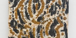
Ken Johnson: “Josh Smith made his mark about five years ago with sloppy paintings and drawings based on the letters of his name. He has also exhibited so-called palette paintings: small, muddy canvases on which he mixed colors to paint other paintings. Lately he has expanded his repertory to include expressionist painting � abstract and representational � and pasted-on digital prints. Still, there is an irritating, juvenile quality about what he does. His work resembles that of a manically industrious undergraduate with vague conceptual pretensions gleaned from art history courses. “In two standard sizes � 5 by 4 feet and 4 by 3 feet � the 38 paintings in this show hang cheek by jowl, creating a pleasing, wrap-around, decorative effect. Some depict fish, leaves and other natural objects in a clumsily exuberant, expressionist manner. Others involve digital paper reproductions of paintings glued onto panels in grids and messily overlaid by real paint. In any given piece you may discover passages of beauty and insouciant verve, but the overall impression is kitschy, as if Mr. Smith meant not to make good paintings but to mock clich�s of Modernist aesthetics.
“The way the paintings are installed � like anonymously cranked-out products in a factory store � suggests a subversive, quasi-Marxist intent. But if Mr. Smith means to critique the marketing system, it is not at all clear. There seems to be a mindlessness about his work that makes you wonder if even he knows what he is doing.”
When Two Coats of Paint saw the show last week, our reaction was exactly the same: exuberant quantity masquerading as content.
“Art Green,” Curated by Jim Nutt. Cue Foundation, New York, NY.Through March 28.
Ken Johnson: “Made with a meticulous touch in luminous, confectionary colors, Green’s new paintings assert a kaleidoscopic complexity whose order takes considerable time to figure out. On star-, diamond-, circle- and otherwise eccentrically shaped panels � as well as on rectangular ones � representations of ceramic tiles, panes of glass, pieces of masking tape, interwoven colored ovals and wood-grained inner frames are intricately layered. Shadows of airplanes, birds, scissors and other objects add more illusory layers. In some, a much enlarged woman�s finger with a glossy red nail rises up from the bottom of the picture. In all this, Mr. Green plays extensively with illusions of semitransparency, so that you are often unsure whether you are seeing through one layer to another or seeing one layer painted atop the other. There are also ambiguous relations between two and three dimensions. Like the famous duck-rabbit image, which you can see as one or the other animal, but not both at the same time, Mr. Green�s paintings conflate contradictory illusions to visually gripping, mind-stretching effect.”
Read the entire Art in Review column here.


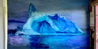
Online Smith’s stuff often looks like prints (lino/wood cuts etc) and the scale is really hard to read.
I get a 50s retro feel (CoBrA, Tachism) from a lot of it. The sheer variety reminds me a bit of Kippenberger’s parodies.