He had bought a large map representing the sea,
Without the least vestige of land:
And the crew were much pleased when they found it to be
A map they could all understand.
“What’s the good of Mercator’s North Poles and Equators,
Tropics, Zones, and Meridian Lines?”
So the Bellman would cry: and the crew would reply
“They are merely conventional signs!
“Other maps are such shapes, with their islands and capes!
But we’ve got our brave Captain to thank
(So the crew would protest) “that he’s bought us the best
A perfect and absolute blank!”
— Lewis Carroll, The Bellman’s Speech from “The Hunting of the Snark“
In Italian “amare” is the verb “to love,” “al mare” means “to the sea;” “ma” universally alludes to “mother” and similarly, the Chinese ideogram of “sea” contains the ideogram of “mother.” If to go to the sea is to love, then there is really no specific location where we are to love. If to be closer to the sea means to be closer to the source of life, then there is no better reminder of our connectedness than the ocean because of its presence and its fluidity.
— Kristin Man
Contributed by Dion Kliner / Situated in Vancouvers original Chinatown, the Sun Wah Center has been an artistic hub housing a diverse cross section of the cultural community since 2016. In the Centers windowless basement, the Canton-sardine Gallery is isolated from street noise and has no natural light. For Kristin Mans, A-MARE to love-to sea, the gallery had been submerged in a deep violet-blue light and the sound of water that spilled into the hallway. Inside, the interwoven ribbons of paper, fabric, and plastic of the individual works were subtly lit, evoking the memory of the Vancouver Aquariums display of delicately tentacled jellyfish of vibrant colors glowing against a background of the same violet-blue. Having to wear a mask, as we do these days, the sense of immersion in the sea was total.
To Carl Jung the sea is the favorite symbol for the unconscious, the mother of all that lives. Man concurs with Jung, and turns his sentiment to her exhibition by finishing his sentence therefore, it is an element of conveyance, a symbol rather than literally the theme of the exhibition. At its heart (and how can one not talk about the heart when speaking of love and mothers) A-MARE is about light; symbolic of enlightenment, transformation, and, for Man, a guarded hope. This is manifest in A-MARE symbol (orange), a glowing, orange heart of LED neon tubing, the first work seen as one comes through Canton-sardines door. A schematic wave intersects the hearts two top lobes that have been extended to form a lemniscate, the familiar figure of an eight laid on its side representing infinity, but better thought of in a more poetic form as the infinite since its referring to love and the sea. The incorporation of the lemniscate, with its etymology from the Latin decorated with ribbons, is a clever, double entendre considering the construction of Mans works from hand-cut strips of material.
Iterations of “A-MARE” began in 2018, and have been exhibited in Spain and Italy. As with earlier work, most of the work at Canton-sardine is developed from photographs taken by Man in proximity to water, presenting a compendium of the places shes lived (Hong Kong, Wales, Italy, Spain, the United States, and Canada). Mans first step in making a piece is deliberating over her photographs, searching for combinations that stimulate layered memories and feelings in her, or will communicate a message to others. Some photographs she chooses for their content, others for their color, always keeping in mind an aesthetic and communicative balance. Once she has decided on a group they are printed to size on a variety of papers and fabrics, after which they are gathered into an ordered stack and the flat photographs are transformed into a sculptural object through a process of cutting and interweaving. In some like O(range) Canada, and Sea on fire, the weaving is more orderly, the end result flatter, more rectilinear and wall bound. Others, like Seafall part I (Orange), and, Black hole sun, arent so much woven together, as impossibly entangled masses of photographic strips. Seafall part II, an installation combining printed images on fabric and paper, recycled plastic, and a mirror, stretches between adjacent walls, completely engulfing a steep, narrow staircase.

At the preview I was caught off guard as Man emerged from a small, side hallway wearing Seafall part 1 (Orange) like something from a grotto. A thin line of orange LED neon snaked through the strips of black and white images of Hong Kong, the Atlantic Ocean off the coast of Wales, and the beach at Spanish Banks in Vancouver. On her head she wore a veiled hat made from a plastic six pack ring and the flaming orange mesh bag that grapefruits come in. In the violet-blue light, Man glowed like a bioluminescent creature in the darkness of deep oceans. After the preview Seafall part 1 (Orange took its place on the wall hung from a single nail by a piece of clear plastic tubing. Clearly related by their pendulous forms and inclusion of LED neon, Plastic Ocean IV: Torus in Eclipse (White), and Plastic Ocean V: Torus in Eclipse (Blue), depart the wall and are shown as fully three dimensional by being hung from the ceiling. All three resemble things unrelated to art, like tangles of net or seaweed, and shifting shoals of fish, but they also bring to mind Richard Serras 1966-67, Belts, strips of vulcanized rubber hung from hooks on the wall (one of which has an erratic curl of neon tubing running through it), and especially his 1967, White Neon Belt Piece.

The way Man manipulates them, the photographs lose their steadfast individual identities as place, as image, as photograph, and are transformed, not by the dissolution and merging of their individual boundaries, but by the complex and inextricable entanglement of their bodies. Their integrity as discreet photographs remains distinct, the edges of the strips remaining hard and sharp, even if the original image is barely readable. Its a technique and an effect that makes for an interesting comparison with pictures using an impressionist or pointillist one where, seen close up, separate and distinct colored marks, like red and blue, retain their individuality in an unreadable image, yet from a distance are mixed in the eye to create violet, and take their part in a successful image. If Mans creative approach were applied to a comparison of the divergent ideologies that Canada and the United States take to the integration of their immigrant populations, hers is an illustration of the Canadian mosaic as distinct from the American melting pot.
When Vesuvius rises in Vancouver shimmers delicately in silvery grays and blues. Its images of calm seas printed on fabric and paper have been cut into individual strands that rise to the surface and sink back, undulating between foreground and background. Just above Vesuvius midpoint sits a dark gray rectangular shape, and at its top, the profile of the legendary volcano that buried Pompeii, Herculaneum, Oplontis, and Stabiae in 79 CE has been cut out of the uppermost layer of gray fabric revealing the sky from an image of sky, mountains, and sea in values of violet-blue with which it is interwoven. Down its center, a row of small knots have been tied in the loosely woven strands of fabric as if tenderly holding the whole thing together like the laces of a bodice, or ribbons in my daughters hair. Its a beguilingly gentle construction. But beneath the intimate laces of a bodice lies a beating heart, and rising over the calm seas is a sleeping, but still dangerous volcano; both with the potential to erupt with explosive force. Even as Man puts light at A-MAREs heart, she also knows, as we do, as mariners Joseph Conrad and Herman Melville have written, that there is a heart of darkness. A-MAREs dark heart is the damage we do to the seas with plastic like the slowly spinning gyre of the Great Pacific Garbage Patch, and the way theyve been used (consciously or not) as modes of transportation for colonization and international trade, resulting in suffering and tragedy including slavery and the spread of disease.

Tribute to Zong! the slaveship is the darkest, most complex and arresting of AMAREs woven pieces. It is also unique in its inclusion of a dozen photographs of birds and poultry, from common ones like a pigeon (albeit a dead one in Venice) to exotic ones like a peacock, and a painting from art history: JMW Turners, Slave Ship (Slavers Throwing Overboard the Dead and Dying, Typhoon Coming On), of 1840. The center of the painting is yellows and oranges. The ship is ghostly, its hull white, merging into the mist and waves of the background, its masts red against the sky. In the foreground, limbs and shackles disappear below the oceans surface, surrounded by fish that have come to feed on them. Turners influences were varied and many: James Thomsons 18th-century poem, Summer, describing a slave ship caught in a typhoon; the anti-slavery campaign in Britain at the time; and, most directly, the true story of the Zong. In 1781, 132 sick and dying Africans en route to slavery were thrown overboard by the captain and crew of the British slave ship in the expectation of collecting insurance money only available for cargo lost at sea. When Turner exhibited the picture at the Royal Academy in 1840, he paired it with the following extract from his unfinished and unpublished poem “Fallacies of Hope” (1812):
“Aloft all hands, strike the top-masts and belay;
Yon angry setting sun and fierce-edged clouds
Declare the Typhon’s coming.
Before it sweeps your decks, throw overboard
The dead and dying – ne’er heed their chains
Hope, Hope, fallacious Hope!
Where is thy market now?
Tribute to Zong! the slaveship is a roiling mass with a center of yellow and orange, partially from Turners painting, but also from Mans photographs of red and orange sunsets over the sea in Hong Kong and Vancouver. A clump of strips several feet long dangle from the bottom left corner, looking ominously like the thongs of a cat of nine tails, a common instrument of punishment on British ships for slave and sailor alike. Man uses Turner to refer to colonization and the international trade in slaves, she uses her birds to add color, and to address aspects of international trade, and the mistreatment of resources like the sea and livestock, that result in the degradation of the environment and the spread of disease as an outgrowth of the expansion of human civilization into previously uninhabited regions that bring them into contact with new viruses and bacteria. Interestingly, Mans tribute in Tribute to Zong! the slaveship isnt to Turners painting, but to Canadian poet M. NourbeSe Philips book length poem, Zong!, composed entirely from the words of the case report, Gregson vs. Gilbert, related to the murder of the 132 Africans on board the slave ship, and its influence on her. Man was also aware of Turners poem, and like him paired her exhibition with her poem, Between, that concludes:
between
the yellow and the violet
the fabric of our humanity
light of dawn and dusk
blood has laced the blue
certain questions remain
not only of time and space
my world
breathingits
meaning, in-the-meantime

The title of Turners fragmentary poem, “Fallacies of Hope, makes clear how Turner must have felt in 1812 when he wrote it, and as he still must have twenty-eight years later in 1840 when he showed it. Although slavery had been outlawed in Britain seven years before in 1833, Turner still had plenty of reason to feel hopelessness in the face of slavery; it remained an active force in South America and Cuba until much later, and though it was made illegal in the United States in 1808, the practice of slavery continued to be legal in much of the US until 1865. The eight stanzas of Between that are printed on the walls between Mans pieces, rises and fall in an undulating pattern like waves, or the sun, or the breathing of humanity. These are all peaceful images that Man balances with her recognition of the conflicts of the heart, and the bloodlaced blue of the seas. The Museum of Fine Arts Boston, in whose collection Turners painting is housed, describes it as, a striking example of the artists fascination with violence, both human and elemental. Tribute to Zong! the slaveship is a merging of beauty and ugliness, and an example of Mans fascination with the violence that humans can wreak on something as elemental to ourselves as the sea.
Mans technique of stacking, cutting and weaving of successive photographs is symbolic of how we see and experience the world. We dont really see just what is in front of us; maybe we never truly see what is in front of us at all. Instead we see through the veils of everything else weve ever seen and experienced; in a series of small knots I see my daughters hair, for Man the mountains across from Spanish Banks are also Vesuvius, and as she looks at the seas she cant help but think of a slave ship.
The two non-photographic exceptions are, Back to Venus, and Misty: east meets west, an interactive, new media installation, and a split screen music video. Even so, Man feels her process as being fundamentally the same, weaving together concept and aesthetic to bring out meaning. Back to Venus, developed in collaboration with Chimerik Collective, is built into a large three-sided alcove. Eleven feet opposite the alcoves opening, a small, round mirror is attached at eye level to the horizontal center of the back wall. From the center of the openings threshold its just possible to make out your face in the mirror. Breaking the plane of the threshold activates the advanced computer programming and motion detection technology to transform movement into sound, and undulating, horizontal patterns of projected light that move along the floor and up the back wall. As the sea is in constant motion and ever changing, Back to Venus shows how we can be transformed, and likewise be transformative of our environment; Man describes it as, symbolic of how we are unique, have agency and can make a direct impact on our environment and our society, individually and collectively. For Misty: east meets west, Man wrote lyrics that she sings in Cantonese to accompany Erroll Garners 1954 instrumental jazz standard Misty. As she wistfully sings, a sailboat sails towards itself from the left and right sides of the screen on a blue sea against mist shrouded mountains. Reaching the center they merge, disappear, reappear, and sail back towards the opposite edges from which they came. Mirrors on either side of the screen repeat the images and make them infinite.

Really trying to see the sea, like fathoming love and the unconscious, is nearly impossible. Not the big, surfable waves near shore that build and curl and break, that seem to be stable long enough (like something with a single identity) that you could name the wave or that wave. Even though we misspeak, for it is never the same wave, just like the river into which we step is constantly changing. But the sea beyond, where its as impossible to fixate on the infinite and nameless risings and fallings of ripples, and rollers, and swells in all directions as it is to individuate them. Out there on the surface of that shoreless sea, stable identities are absent, a reminder of the primordial sea in which life evolved, and a little bit of which we all carry within ourselves, like a little spark of the collective unconscious. Through “A-MARE,” Man wants to let us know that we can get beyond the forces that push us back towards familiar shores. Unlike the Captains map, its not a perfect and absolute blank that we have to become, but if we unbind ourselves from conventional signs we can precipitate the relaxation of boundaries, unshackling the power of transformation, making change in the relationship to self, others, and the world, possible.
“Kristin Man: A-MARE to love — to sea,” curated by Steven Dragonn. Canton-Sardine, 268 Keefer Street, Unit-071, British Columbia, Vancouver. Through November 27.
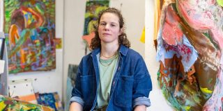
About the author: Dion Kliner is a Vancouver-based sculptor and arts writer who has published more than forty reviews and catalog essays.
Related posts:
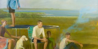
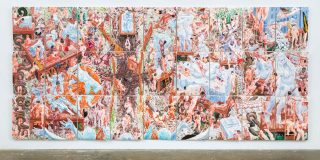
Art & Film: Liquid asset in The Shape of Water
Summertime blues: Clark, Fagan, Carrigan, Dubicki, Hocker, and Samelson in Torrington
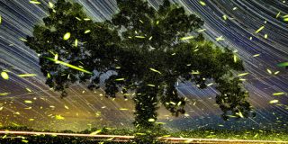
Stephen Maine and the ice trade
NOTE: If you enjoy Two Coats of Paint‘s independent art coverage, please consider making a tax-deductible contribution to the 2021 Two Coats of Paint Year-End Fundraising Campaign. Thanks. Click here.