Guest contributor Adam Henry / Painter-poet Sam Jablon is poised to open a double show in April occupying both Freight + Volume’s downtown gallery and their experimental uptown space called Arts + Leisure. I first met Sam at a group discussion on painting’s possibilities at the home of Saul Ostrow. We quickly exchanged studio visits and have an ongoing dialog about text, language, and the interesting complications that occur when they are used in painting. Most text that we encounter on a daily basis is hyper designed. Through the process of painting Jablon works to challenge these conventions; his work has a rawness that seems anti-designed. The paintings are slow reads in our fast paced world- this is both rare and appealing. I often find learning how painters think is as interesting as what they think. I was curious about Sam’s decisions, process, and his work’s history. We conducted this interview as he prepared for his upcoming exhibition “Life is Fine.”

Adam Henry: You have a very personal history to the additive parts of your paintings. Can you explain how you gained access to the tiles, glass, and mirrors? How did you decide to start using them in the work? What was the impulse or impetus?
Samuel Jablon: My mom runs a glass tile design studio in upstate New York. I spent a significant part of my life working with glass in the studio, so that is how I have access to the material. I started using it when I was in graduate school, I had no money and I was running out of material. I looked at what was around me, and there was glass tile and mirror. Basically I started using them out of desperation, and the material helped develop the work. The words took on dimension and reflection, they become difficult to read, and I became interested in the tension between materiality and legibility, so I kept pushing the work and material.
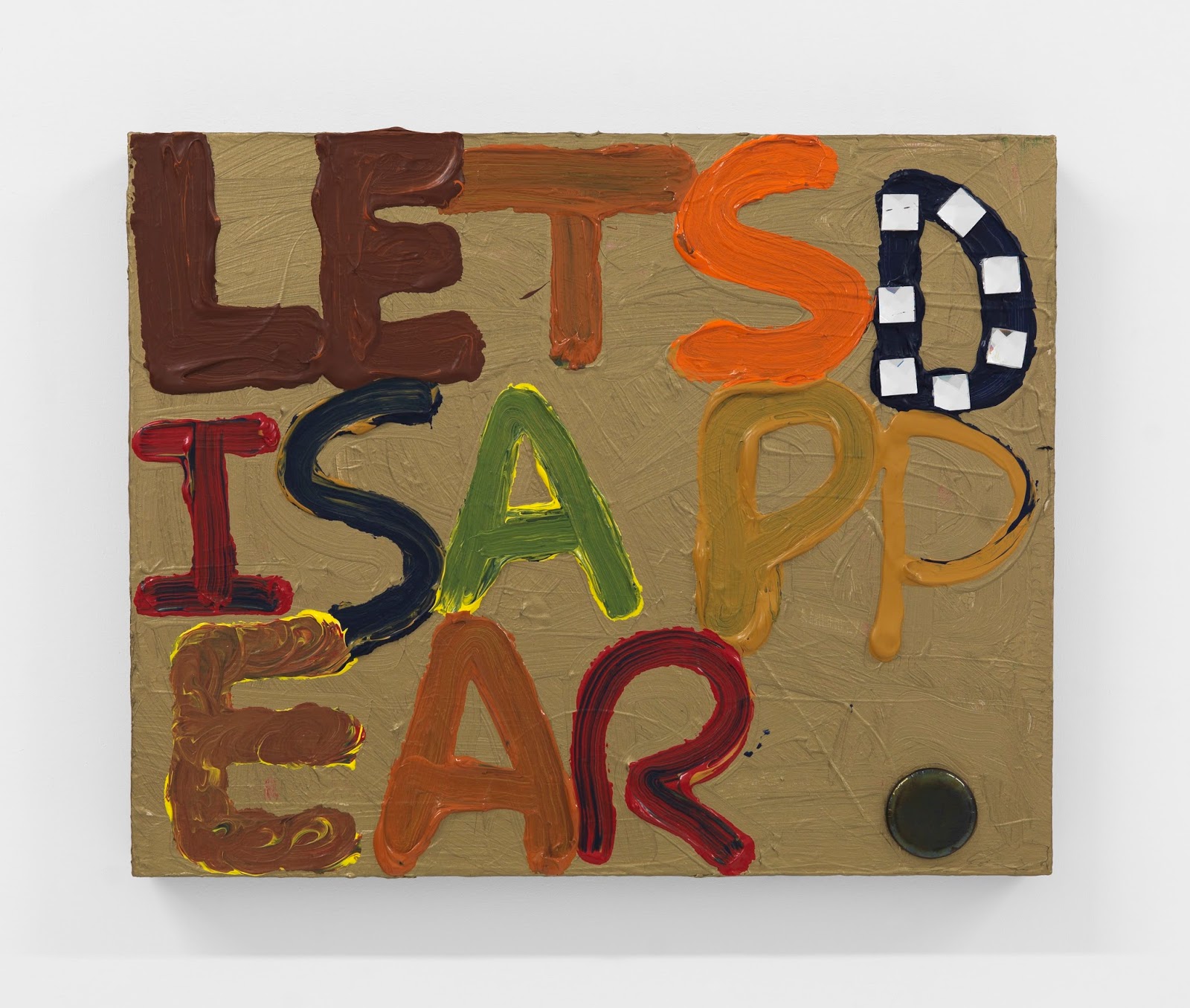
Henry: Color in your paintings has as much “syntax” as the words or phrases that you are painting. How do you choose and develop your color?
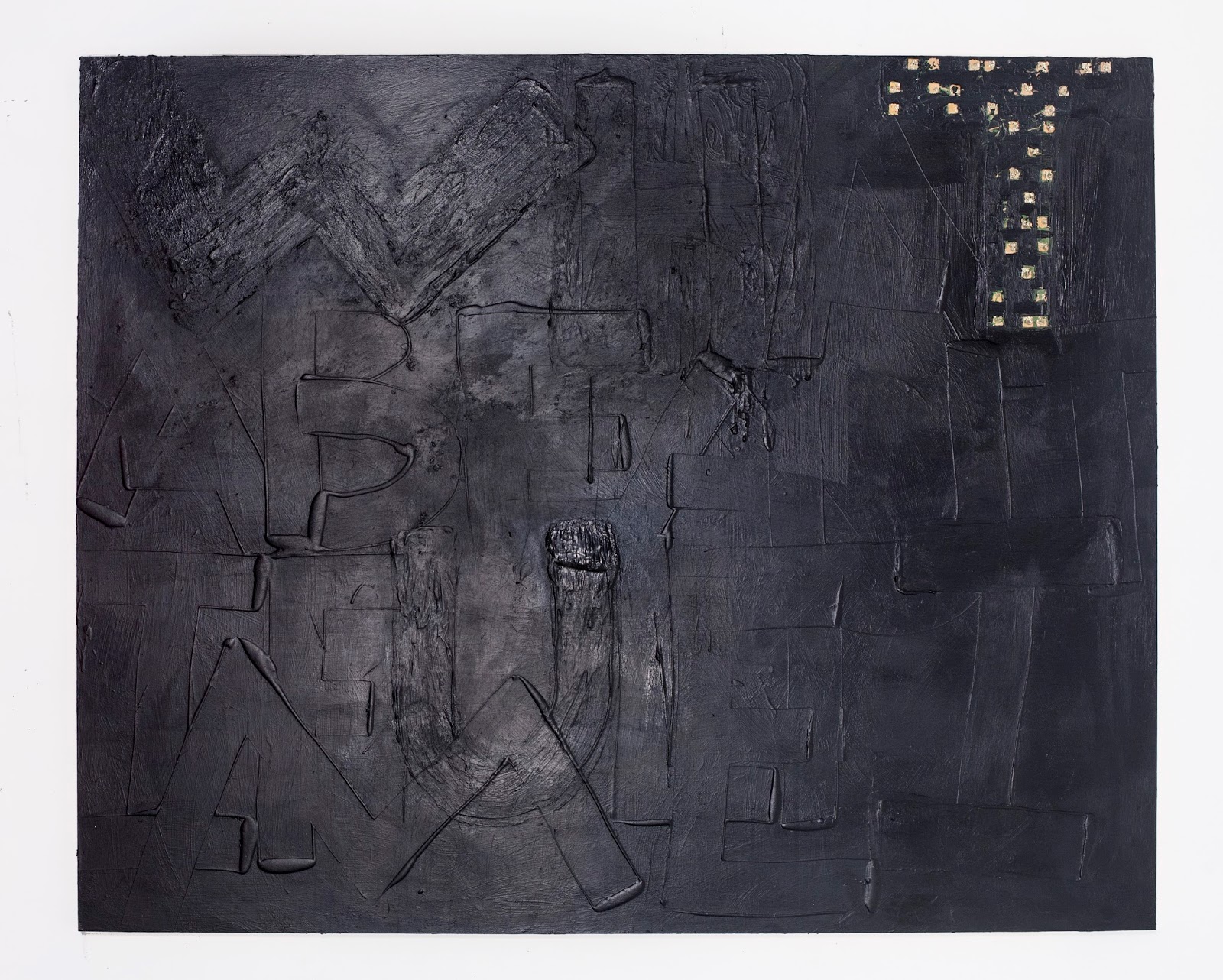
Jablon: The color takes a while to develop. There are normally layers and layers of colors. A painting can look like a rainbow and end up solid black. Colors are erased and changed almost without concern, and slowly build to final color or layer that is chosen in response to where the painting is. It is always a somewhat intuitive decision.
Henry: How do the color decisions change as you develop the painting? Do you have an idea in mind before you start, or is it through the process of painting that you arrive at the final color relationships?
Jablon: The process of painting really guides the final color relationships. Covering or erasing layers is an important aspect of the color. There are always small patches left from all the layers, hints of what came before.
Henry: Simultaneous seeing and reading is required when experiencing your work. I often find myself going back and forth between the paint texture and the words. It creates a type of loop that encourages one to see paint as language and language as visual. The paint surface and composition delay the reading of the text. Do you have specific viewing speeds in mind for the audience?
Jablon: I want people to sit with the work. There’s a struggle between the material and language, and if a viewer focuses on reading the text they miss the painting, and vice-versa. I am interested in that in-between space where the work is solely visual. In that moment one is simply confronted with its objectness.
Henry: We use very different parts of our brains to make language and visual decisions. How do you reconcile these while you are working on a painting?
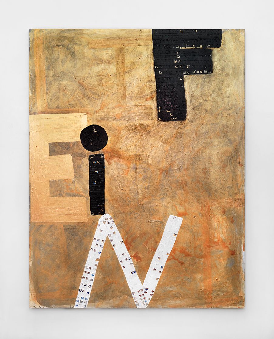
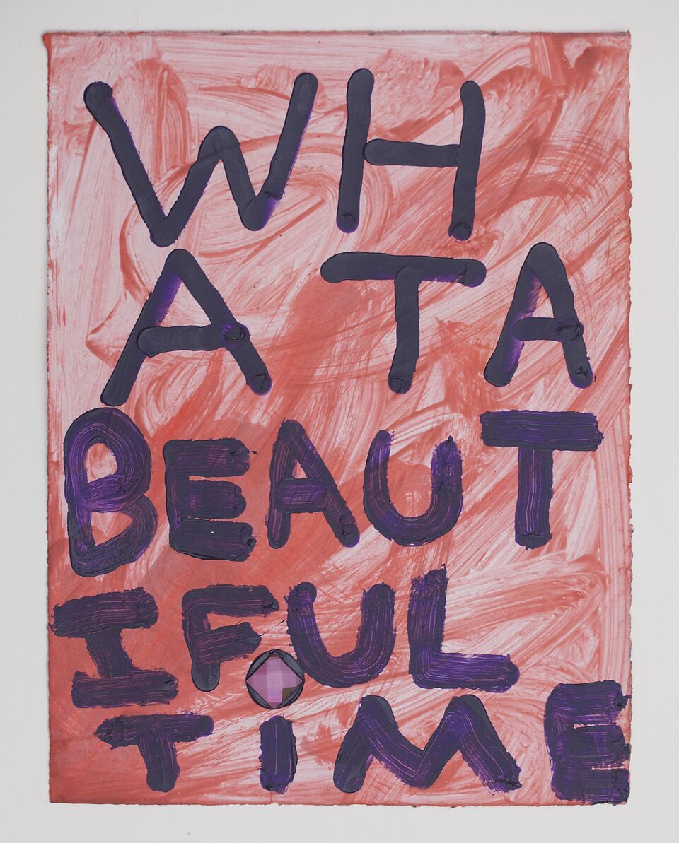
Jablon: Once I choose a text and figure out the layout of the letters the work becomes about form and material. So, there is only a short time that I am focused on what the text says. I use color and material to either subvert or highlight the text. Like, in the painting, Beautiful, 2015, the painting is a heavy almost tar like black, mirrors are smashed and the text reads “what a beautiful time.”
Henry: We have spent a lot of time in your studio discussing scale. Some of the most intimate works are the most challenging because of shift in font scale. How do you decide on what phrases, poems, and words are used and at what scale?
Jablon: Scale is an important aspect to the work. The works range from body sized paintings to intimate small works. The shift creates different ways of seeing, it’s either up close and personal or from a distance. The phrases don’t change much between the sizes. Sometimes I will repeat a phrase on a small work and a large work.
Henry: At a certain point you decided to blend your poetry and painting practices. Was this an “aha” moment or did it happen gradually over time?
Jablon: It was an “aha” moment that took awhile to arrive at. I was going to a lot of poetry readings, and was reading a lot, and I always felt there was something missing. I wanted to see how poetry could be visual and more experiential. That was basically why I went to graduate school, I wanted to merge the practices into one interdisciplinary practice.
Henry: You and I have talked quite a bit about our shared appreciation for the work of Alfred Jensen. Can you say what it was that attracted you to Jensen and how has that relationship changed and developed over the years?
Jablon: I love Alfred Jensen’s work. It’s totally nutty. I believe that he could explain every piece of every painting, but it would probably only make sense to Jensen. The thing I respect about Jensen is that he just kept making the work he wanted to, even if it was nonsense to everyone around him, he just kept going.
Henry: There is no punctuation in the paintings. Is this to make the words and text continuously repeat in the viewer’s mind?
Jablon: I tend to never use punctuation when I am writing poetry, and all the text I use starts out as poetry. Periods seem so final, so complete, and I want to avoid that completion.
Henry: Surface is an important component to your work. Do you have a pallet of possibilities set out for each work or are they arrived at through the process of creating the paintings?
Jablon: I never have a plan for the paintings, my ideas always seem to change mid way through the painting, and it becomes an entirely different thing. So, yes, they are arrived at through the process of creating a painting.
Henry: There is a tremendous amount of layering in your work. I’m curious how you start a painting. Do you lay down some marks or field of color or do you go directly into the text?
Jablon: I’ll start with one or two colors, and just make marks for awhile, and then there is a process of trying out text and colors, all the layers are created by things that did not work, so I keep pushing the work until I don’t have anywhere else to take it.
Henry: Your forthcoming show will be split between two different spaces. Can you speak a little about what it will mean to have the body of work occupy two different spaces and how you decided what work would go into which space?
Jablon: The idea was to do a show that connected both spaces. I find the distance challenging because the galleries are in very different neighborhoods. The larger paintings will be primarily downtown mixed with a few works on paper, and the works on paper will be primarily uptown mixed with a few larger paintings.
“Sam Jablon: Life is Fine,” Freight + Volume and Arts + Leisure, New York, NY. April 9 through May 15, 2016.
About the author: Adam Henry is a Yale MFA grad who lives and works in Brooklyn NY. His most recent solo exhibition was in 2015 at Meessen De Clercq Gallery in Brussels.
——
Two Coats of Paint is licensed under a Creative Commons Attribution – Noncommercial-No Derivative Works 3.0 United States License. To use content beyond the scope of this license, permission is required.