
Berlin-based artist Anselm Reyle explained
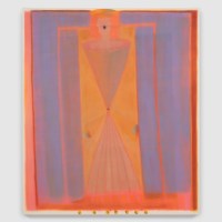
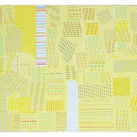
in a 2008 Art Review interview that he’s interested in “riding the border of tastelessness.” Unfortunately, embracing kitsch and bad taste can’t inoculate his work against being bad. When I entered his installation at Frieze last week, the fabricated wall pieces were, hands down, the worst at the fair. The glitzy, large-scale “paintings” depicted cute animals and expressionist drips and spatters using a tired paint-by-numbers strategy. Outsourcing production, Reyle, who also shows at Gagosian, fashions himself a conceptual artist concerned with notions about abstraction and consumer culture. At Frieze, however, these shallow, overproduced pieces looked like trophies for uninformed collectors who fancy themselves in on the joke. I wonder what kind of work Reyle would make if he didn’t have any financial backing.

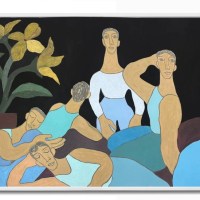
Images: Anselm Reyle installation, Contemporary Fine Arts (Berlin), Frieze Fair, New York, 2012. The pictures were collage constructions comprising flat paint, foil, colored mirror, and plexiglass shapes. For a 2011 solo show, Reyle also designed Jetson-style couch sculptures.


Later in the week look for the Best of Frieze.
Related posts:
Regaining relevance: Writing critically about art fair art
Paint by Numbers Goes Highbrow at Chelsea Gallery
——-
Subscribe to Two Coats of Paint by email.


agreed.
Jennifer Rubell's nutcracker was worse.
When I saw the headline I tried to think of a brief description of what Reyle does, but then I read your "trophies for uninformed collectors who fancy themselves in on the joke" and I realized I couldn't do better than that. Well put.
As a project it's pretty lame to start with. But it's also one way over-subscribed.
I liked these and thought they were a logical next step in his oeuvre; which has always been simple, bright, shiny.
It looks like there was little thought put into his work, it seems irrelevent to paint of the present and holds no interest for most.
It toys with twee in a boring and quite dull way, using colour so poorly.
Yes the images remind me of colouring books, but the way he has coloured doesn't take this into account.
What was he thinking? Scratch that, how did he end up in Art Review and at Frieze?