
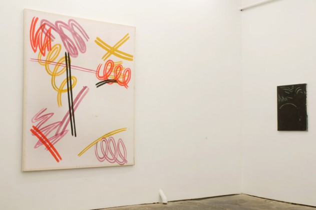
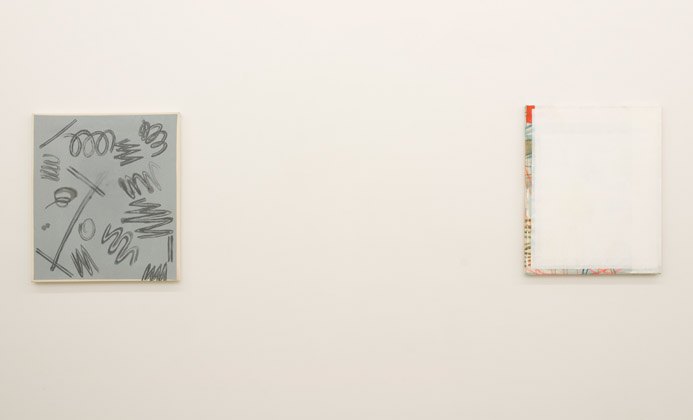
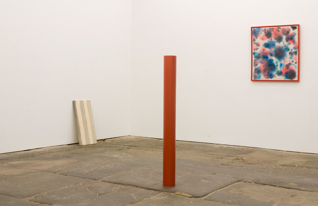
At Time Out New York Anne Doran reports that Matt Connors, in his second solo show at Canada, continues to develop his idiosyncratic painterly language. “Matt Connors�s paintings, like those of his contemporaries Joe Bradley and Richard Aldrich, are scruffy, minimal and coolly cerebral. In his promising debut at Canada two years ago, he employed various tropes of modernist abstraction, from bright, geometric compositions to filmy washes to wavering grids and stripes. In his second solo show at the gallery, Connors seems increasingly focused on the process of art production and display, even as he continues to reference stylistic conventions drawn from recent art history….
“Presiding over the show is a poster-size photograph taken from a documentary of a 1970s protest, showing a placard that reads ‘you don�t know.’ Its boldly lettered but absurdly vague message suits a body of work that appears, at first, inchoate. Little here, however, has been left to chance. Out of such small incidents and gestures as a crooked rectangle, a scuffed surface or a doodle writ large, Connors has devised a painterly language that is smart, original and stealthily persuasive.”
“Matt Connors: You Don’t Know,” Canada, New York, NY. Through Nov. 21, 2010.
Related post:
Two Coats slams Matt Connors’s first show at Canada
“Kind of like a cocktail party at a really nice loft, where the drinks may be weak, but the atmosphere and conversation make hanging around worth your while. Frankly, I find the installation fetishization currently permeating gallery and museum exhibitions a bit like overwrought interior decoration.”


I love the color. I love the idea of this interior but if I were to have this in my home, I would prefer a much more shabby one.