
In painting as in music and literature, what is called abstract so often seems to me the figurative of a more delicate and difficult reality, less visible to the naked eye.
— Clarice Lispector
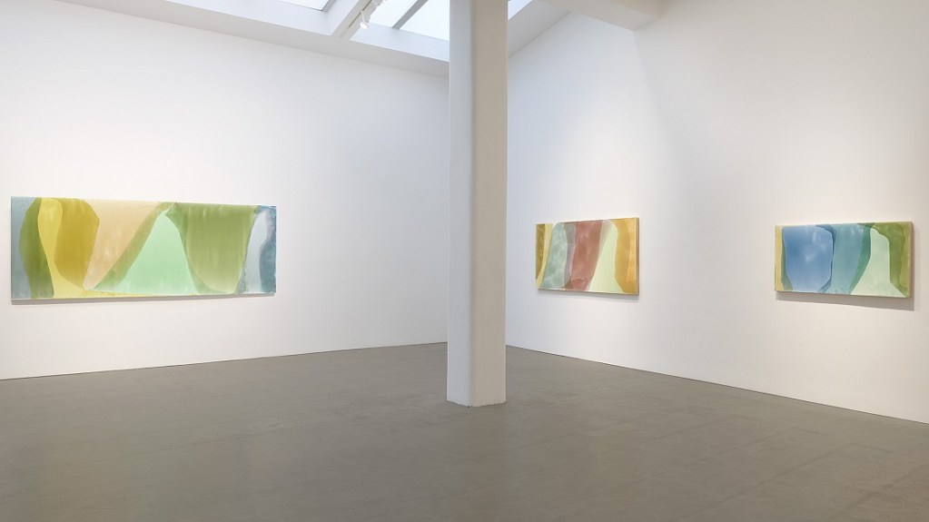
Contributed by A.V. Ryan / Jill Nathanson’s solo show “Chord Field” opened in late June at Berry Campbell Gallery. It is her fourth at the gallery but her first in its spacious, skylit new space. It seemed a fine opportunity to talk to her about her work, new and old.
A.V. Ryan: The new paintings are some of the largest you’ve ever made; one is over nine feet long. They seem to delight in all that space. Each painting has passages of luminous color, dappled areas where color and light contend, and overlapping colors of often indescribable hues. The term “chord field” alludes to color field painting. Can we begin with your view of color?
Jill Nathanson: My life as an abstract painter began in relation to and inspired by Color Field painting. When I was a student at Bennington, I wanted to make paintings like the Color Field painters did but with the potential for more complex and emotional expression. It has taken decades and engagement with other kinds of art to find my way. My work still puts color first and my decisions about drawing are in the service of giving the color the expanse or sequence it needs to glow, to be light-like. I still work with a Color Field approach to expansive color, but I push back against the luxuriousness of much of that work by introducing different kinds of felt pressure within that expansiveness. In the small studies I do to develop paintings, I use a limited sequence of colors that together form a network of active relationships. The sequence needs to have tension but, as a whole, to glow. It has also taken decades for me to find the right materials that enhance the color interactions. I pour transparent acrylic medium onto well-gessoed wood panel, which allows for all kinds of flows in the material realization of the work.
AVR: This is not the first time I have had the pleasure to talk with you about your work. Our first conversation was coincided with your second show at Berry Campbell called “Cadence.” We talked about Goethe’s color theory. For him, colors are the acts and passions of light. His ardent view of color is the product of a lifetime of meticulous color observations and experimentation. His key insight into the mutability of colors seems particularly relevant.
JN: I am in total accord with his approach. I have an experimental approach to color, to what colors do to one another and, like Goethe, find color to be endlessly surprising. Colors change one another and I use colors that are vulnerable to being changed. I find that colors can be sequenced to need each other, like musical chords. I work to set up a desire for a certain color that can move us across the picture. That net of desire also extends to the composition: how much curve or angle do these color areas need to pull our eyes out to the edges of the picture.
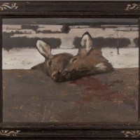
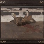
AVR: Many of your paintings move left to right in a fundamental way while also rewarding non-directional looking. Titian’s The Death of Actaeon is an important painting for you. Could you talk about how it informs your work?
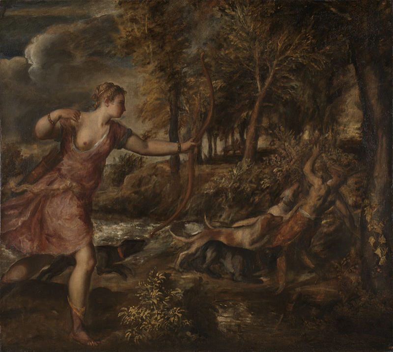
Titian, Death of Actaeon, c. 1559-1575, oil on canvas, 70 3/8 x 77 7/8 inches. Collection of the National Gallery, London.
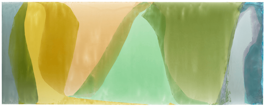
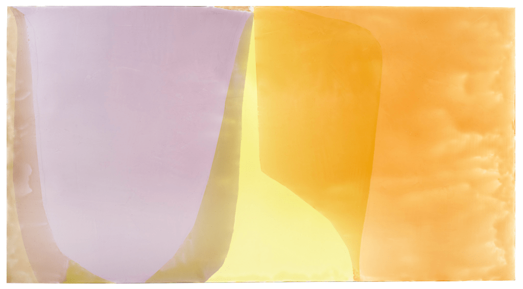
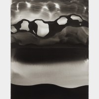
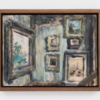
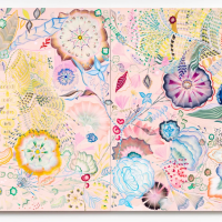
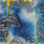
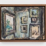
Jill Nathanson, Stretch Radiant, 2023–24, acrylic polymers and oil on panel, 43 x 79 inches. Courtesy of Berry Campbell, New York
JN: It is an astonishing painting. On the left, Diana is shooting the mortal Actaeon with her bow and arrow. On the right, we see the immediate result: he is turning into a stag and his own hunting dog is about to make the kill. The movement across the painting is an existential transformation on the narrative level and visually so surprising and fraught. I want to make that happen in an abstract painting as a visual transformation.
AVR: Can you tell us more about how you approach that kind of visual transformation in your work?
JN: With Part Song, for example, there are only four colors but when they overlap, new colors come about. The four basic colors were found, not chosen; they had to change and exert pressure on one another. The shapes serve the sequences and the pressure of the colors, the expansion and limiting of the colors. There is push and pull in terms of space and the overlaps result in many spatial ambiguities, which is another kind of tension. For example, here the overlaps push the yellow, which would normally advance, back flat onto the surface. For me, these paintings work when colors don’t play their roles too straight. Colors really do change appearance and that can be interesting in a human way, not just optically or technically. Can an orange become cooler than a lavender, play that unexpected role? I think the eye wants the whole deal: life, story, tension, yearning.
AVR: How did you come to this way of painting?
JN: It was around 2010, after working on a series of large collage works made of colored transparent plastic sheets. I cut countless sheets and the cuttings were all over my white studio floor, falling on top of one another. Some random overlaps of two transparent plastic colors seemed to emit light. I’d pick up these scraps and tape them to my wall. Then I started to copy the two-scrap overlaps very accurately in transparent paint. I moved on to adding other colors, careful not to compromise the light. I have no theory about why this light happens with some combinations but over the years I have worked towards ways to base picture-making around it. The colors you see are intermixed and not super bright; the glow comes from the contrast with the adjacent color and other colors in the field.

AVR: You have a very active, even dramatic approach to making your paintings.
JN: The final painting is done with poured thick transparent acrylic, a custom mix from Golden Artists Colors on panel; each area of color is poured to fill a taped-off shape. I pour one color a day, holding the panel up to let gravity move the paint. The pouring allows for lots of color activity; thickening, thinning, overlapping that lets the under-colors come through. A lot happens very fast as it courses down the face of the panel, and I have to make quick decisions about how it flows and settles. The changing thickness of the pour makes an airy breathing in the surface; the space becomes atmospheric, but the drawing flattens out the image. There is a tension between space and flatness. The study, where the planning of the color and the drawing happen, is where the sense of flow gets started: the paint pouring elaborates or fleshes out what the study has already brought about. But the activity of the pouring, with its physicality and risk, shakes up my carefully planned studies and the painting becomes its own thing that I have to respond to.
AVR: You have redefined color field painting and made it your own. Are there other touchstones and transformations?
JN: Prioritizing color over drawing during the development of relationships is something I learned from Kenneth Noland and others, and that persists. But Minimalism was the dominant painting language as I matured as an artist and I learned from the Minimalists, especially early Brice Marden. But I have been thrilled by the artists who brought more personal narratives and painting immediacy into Minimalist painting: Mary Heilmann, Moira Dryer, Harriet Korman, Sean Scully. Ken Noland once said to me, “It’s all about the vibration on the edges of colors.” For me now, it is all about the vibration of the whole, including its materiality; that’s a field. A field as a net of forces and energies, not simply a big area of color. I set things up, I set colors next to one another and in color sequences. Some might say my pictures are made up of shapes, but I think of each color area as a shifting element of an active field. For me, colors and the pressure they exert on each other is the picture – a field of color forces. The way I work with sequence and dynamic structure is often inspired by music.
AVR: You once told me that successful pictures are structurally alive and that pulls you together as a viewer. There is a kind of visual and emotional unification that takes place in that encounter. Yet I also find that there is something about your way of making pictures that alludes to a before and after. They seem to continue invisibly past their own ends. Is there a spiritual dimension to your work?

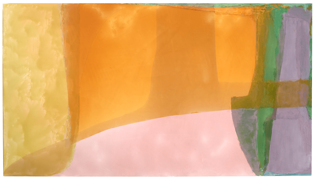
40 1/2 x 78 inches. Courtesy of Berry Campbell, New York.
JN: I find that some paintings offer a kind of contemplative experience; they invite you to open yourself to them and they reward you with a process I would describe as a kind of meaningful unification through the act of looking. Spirituality and sacred text are very much a part of my work. I love your allusion to before and after. When I started doing my color studies in the 1990s, I was amazed to discover a similarity between my sense of color as a dynamic unity and a spiritual exercise described by the Medieval Kabbalists. In their prayer techniques, they visualized colors, and each color was associated with a Divine Attribute so that prayer became a unification of the self’s awareness of the Divine through colors that came together in the mind and words that came together in the heart. If there is beauty in my paintings, it is not a given, seamless one but one that requires unification, an active process, a getting beyond inescapable difficulties.
“Jill Nathanson: Chord Field,” Berry Campbell Gallery, 524 West 26th Street, New York, NY. Through August 16, 2024.
About the author: A.V. Ryan is a sculptor and writer with an affinity for painting and a background in philosophy. She lives and works in Brooklyn.


Wonderful interview!
So good to read more about Jill’s work.
Nathanson’s description of the discovery of color to express the movement and dynamism of a deepened spiritual practice also addresses a broader, universal ethos, and is here beautifully expressed.
I wandered into the gallery by chance one day shortly after Nathanson’s show opened and I was completely blown away by these paintings. The energy of the color fields is palpable as you stand in the room. Great article and awe inspiring work.
The paintings are so beautiful and left me feeling a little unsettled, in a good way, like a deeply satisfying piece of literature. You know you are being changed by the experience. This insightful interview took me even further into the process of creating and receiving inspiring works of art.
“I work to set up a desire for a certain color…” A discovery that certain translucent color overlaps creae light! etc. An exciting interview, thank you!
I wonder what Jill thought when considering Kandinsky’s very conscious writings (and subsequent Bauhaus experiments) on emotional, spiritual and musical energy of specific colors.
A terrific read, very thoughtful and informative. A great description of how the color is built and becomes a space.