

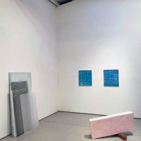
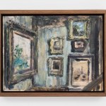
Contributed by Peter Malone / The airplane-hangar dimensions of the top-tier commercial art gallery can be justified by the flexibility they offer both dealer and artist. In 2017, I watched David Zwirner adapt his Chelsea location on 19th Street to accommodate Alice Neel’s modestly sized portraits, then open it up to create the parking lot rug sale vibe that suited Josh Smith’s 2019 “Emo Jungle” bazaar. Those two events occupied my thoughts as I walked through the grandiose layout of Dana Schutz’s recent “Jupiter’s Lottery” exhibition.

The Schutz exhibition is the sort of show that the oversized gallery was originally meant to host. The pairing of gallery and artists requires no adjustment or improvisation, and conveys an unmistakable message: the oversized canvases, preening on oversized walls as if they were already in a major museum, ought to be in one. This raises an awkward McLuhan-esque question: is the scale the message? Have art galleries evolved to a point where the size of a painting, combined with that of the room it hangs in, supplies the better part of its meaning? Does it even matter what the paintings accomplish on their own? Can they be too big to fail?

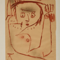
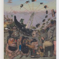
Anchoring the dozen or so pictures and half as many sculptures that make up “”Jupiter’s Lottery” is a colossal canvas titled The Gathering. At 21 x 9 feet, it ups the ante of Rosa Bonheur’s 16 x 8-foot Horse Fair, by a late Rothko. The comparison with Bonheur may seem cursory, but I find it instructive. Bonheur’s dimensions were clearly chosen to emphasize the spectacle of formidable creatures bursting through the urban confines of a Parisian boulevard. The larger Schutz canvas depicts a baroque cluster of grotesque puppet-like figures intertwined with as much physical energy as Bonheur’s stallions but with no hint of any narrative that presumptively applies to sentient creatures. The subject seems to be the absence of a subject. What’s animating Schutz’s monstrous heads and stretched limbs is both unknowable and oddly irrelevant.
Surpassing the scale of a Jackson Pollock or a Joan Mitchell — the once considered “heroic” but now quaint – is accomplished more convincingly by abstract painters. Julie Mehretu’s 2010 Mural in the Goldman Sachs lobby comes to mind, as does James Rosenquist’s 1980 Star Thief. The latter is figural (how else can one describe interstellar bacon?) but its humor and lightheartedness is up front and whimsical. Subject matter of epic scale used to be the animating force behind very large work. Anselm Kiefer’s channeling of the monomaniacal self-regard of Albert Speer and company justifies his work’s exceeding Jacques-Louis David’s 32 x 20-foot Coronation of Napoleon.
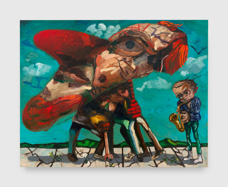

The gargantuan marionettes in the Schutz exhibition are involved in some kind of melee, the instigating events of which are apparently beside the point. We have little to go on to grasp their motivations. The pandemonium doesn’t add up. Their dramatic gestures are both amplified and obscured by arbitrary figural distortions. Assuming it is a work of narrative art, The Gathering is more noise than substance. Imagine the sound of five leaf-blowers roaring over a patch of lawn invaded by three leaves and a twig.

Several critics have suggested that the work mimics the chaos of our digital media landscape. I see the connection, but I don’t perceive a metaphorical undercurrent. To parody media noise is not the same as addressing it, no matter how many variations are presented. One outlier is a canvas with its title, The Arbiters, painted on a faux plaque near the lower edge of the picture. Above sits a reality show panel of disagreeable judges. I’m guessing it was aimed as a preemptive barb at unimpressed critics. The gesture is fair and clearly stated, but it suggests the theme of the exhibition is confined to our insulated market-driven artworld.

Schutz does, of course, offer a nobler theme: Aesop’s tale of Jupiter spawning a race of fools whose curse is to forever consider themselves wise. This brings to mind several candidates – politicians, corporate CEOs, web influencers – but delivers little more than a glib mythological reference, followed up with brawling freaks and distorted figures with inexplicably oversized heads, arbitrarily morphing between animal and human. Placed among the paintings are several bronze sculptures large enough to be monuments. They testify dramatically to their maker’s formal ambition and physical energy, which is considerable. And like the similarly populated canvases that surround them, their chunks of sliced and crushed clay heaved onto precarious armatures celebrate a baroque complexity. But they exude nothing beyond their mash-up convulsions.
What comes across is an erratic giddiness that proves a poor substitute for the narrative focus we associate with monumental figurative work. Schutz is a talented and daring formal composer who has thoroughly absorbed lessons from Beckmann, de Kooning, and Guston. But formal and stylistic knowledge does not guarantee vision.
“Dana Schutz: Jupiter’s Lottery,” Zwirner, 525 & 533 W. 19th Street, New York, NY. November 2–December 16, 2023.
About the author: Peter Malone is a painter who writes about art. He is currently represented by the Silas von Morisse Gallery in New York.
NOTE: The Two Coats of Paint 2023 Year-end Fundraising Campaign is in the final weeks, and our goal this year is to reach 100% reader and gallery participation. For contributions of $150 and above, we’ll send a gift — one of the new Two Coats of Paint coffee mugs. Everyone should have one, right? Please consider making a tax deductible contribution to support the project in 2024. Thank you for all your help keeping the conversation going.


Schutz’s paintings simply do not move me. Lack of pathos. Cartooish and freaky.
I got the same feeling of emptiness from Julian Schnabel’s huge sculptures in a SoHo gallery many years ago. Ms Schutz seems to stand apart from her peers, male and female. She is a force of nature, like a mighty wind, a Moby Dick.
Scale, just to be noticed, is very striving and of course, just scale.
I read Peter Malone’s well-written review with interest, having recently seen the Dana Schutz retrospective that is currently on view at the Musée de l’Art Moderne de la Ville de Paris. Comparing notes: as a painter, I found the Paris show stimulating, in that Schutz provides first and foremost a feast for the eye (Delacroix), in terms of color, paint handling, and formal elements. Malone rightly acknowledges her masterful integration of the Beckman, de Kooning, and Guston influences. Most of the work in the Paris show, however, is not on a monumental scale, starting with small portraits and then scaling up over time, with the best paintings in this show being mid-scale, from the middle period. I was repelled by the turgid, manneristic turn in both the most recent monumental paintings and the sculpture, at least as presented in this exhibition. I haven’t seen the Zwirner show, but based on my viewing of the work in Paris, I would venture that perhaps the retrospective provides more context for judging what Schutz is currently producing than does the Zwirner installation. As for narrative, with all due respect (and in a democratic spirit), I’m a bit puzzled by Malone’s conclusions about a lack of narrative focus. If the Zwirner show is about “a race of fools whose curse is to forever consider themselves wise,” why are oversized heads “inexplicable” ? And if mythology and the excesses of hubris are central to the subject matter, why is morphing between animal and human forms “arbitrary ” ? And, for that matter, isn’t the super scale of the paintings at one with the out-sized hubris ? Fair questions, no? In Paris, the curators highlighted a lot of narrative, which was more or less evident depending upon whether or not you’d read their texts. We viewers all respond differently, of course. As a painter, what I responded to in the Paris show was the painting’s powerful presence, which conveys not from the subject matter itself but from how it is presented. Schutz’s painting integrates the character and ambiguity of her subject, which is the messiness of the human condition. There was no question in my mind that a complex narrative was embedded in what I was looking at, but what I found myself processing was not the story itself but the exciting impact of the painting — the way Schutz paints — on my nervous system. Compelling painting does that. Or it can… causing you to forget the name of what you are seeing.
Is man still the measure?
Scale in a painting relates to its content and effect on the viewer. We get close to small or miniature paintings with curiosity and gentleness. Monumental sized works must be seen at a distance, we are often surprised, in awe.
The 194-inch width in Rosa Bonheur’s painting, a good comparison in Peter Malone’s review, expresses the horses’ movement in a direct linear, central band. It’s a painted feat, we want to ride along.
These formally clear strategies are not seen in Dana Schultz paintings. Their bold, aggressive, disjointed results, suggest comic like absurdities meant to shock. If we get close, we would be fenced into a harsh world of thick and heavy color. Her Visible World is concentric, the implicit sensibility suffocating, the effect is war like.
Do we need any more wars?
Interesting comments! I’ve seen about 7 DS shows since about 2004 and am a fan of her early period, as in her 2003 “Lovers” and 2005 “Presentation”. IMO her strengths are absurdist, basically comedic, like Ensor. When she deals blithely with socio-political content, as in “Elevator Fight” she can seem insensitive if not exploitative, though I did like her painting with Dick Cheney, but the Till painting was an unnecessary blunder.
When she deals with tragedy, as in this show, content looks forced and the effect is theatrical and maudlin (I feel the same way re Kiefer and re Currin’s last show.) So I can understand how one opinion here reads it as quasi war propaganda.
I’ve wondered if she had been too open to criticism by those saying her earlier work lacked light, atmosphere, or seriousness? (Or maybe she feels guilt over her good fortune?) She can be a great formal inventor, captivating colorist and humorist. I wish she’d take a loaf off, maybe turn to Watteau or baccanalian inspiration? She is no late Goya, that’s okay.
Peter Malone’s remarks about the role of scale in Dana Schutz’s paintings, and in painting in general, are thought-provoking, especially in an era where few art writers venture beyond thick description and fewer still raise questions as provocative as the ones raised here.
Yes, the money-charged art world and the leviathan-scaled galleries, in particular, explain a lot about Schutz’s Brobdingnagian scale. But I also think scale is part and parcel of our zeitgeist, which basically says, “Do something big and spectacular and you can be pretty damn sure money and admiration will follow.”
As for Schutz’s imagery, the artist has many fans, but I find her imagery falls flat. Her paintings make me long for a lone, easel-sized, emotion-charged, Emil Nolde painting, viewed in a small room, where I can sense Nolde struggling to express himself, and feel his deformations of people and things to be a consequence of that struggle–a means, not an end. Schutz’s cartoony grotesqueries, by contrast, seem as if they could be AI-generated.
Schutz has her fans, to be sure, but her work reminds me of Macbeth’s often-quoted words: “Life’s but a walking shadow; a poor player, that struts and frets his hour upon the stage, and then is heard no more: it is a tale told by an idiot, full of sound and fury, signifying nothing.”
Schutz addresses the picture plane well, one can’t help but notice it, especially in previous works. These pictures aren’t too big to fail, but some don’t hold up well. Some do, which is understandable, not everyone can make amazing work every time. Schutz, of course pushes the media to extremes, which I find fascinating but in other instances, I question its construction.