

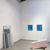
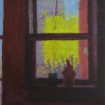
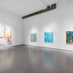
Contributed by Sharon Butler / Kate Shepherd’s 2025 exhibition “ABC and sometimes Y,” at Galerie Lelong & Co. in New York, vibrates in the space between precision and poetry. The paintings are specific and unshowy, rendered in colors that Shepherd selects for their emotional undercurrents. She teases out big questions: How do we interact with the world? How can we untangle what we see? And how do color and form quietly alter our perceptions? The result is a kind of geometric sorcery whereby shapes don’t sit still – they shimmer, shift, and keep you guessing. Every line, every wobble feels heartbreakingly human, which is extraordinary for geometric abstraction.


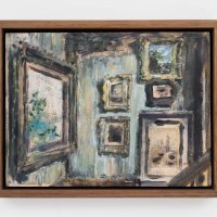
Shepherd’s process combines high-tech precision and hands-on imperfection. It starts with digital sketches in SketchUp, a 3D modeling app, before moving to smooth aluminum panels pre-coated in glossy enamel paint. Once the panels are dry, she marks plot points, then painstakingly connects them using a lettering brush with a steady wrist against a wooden straight-edge. The slight meanders and minutely errant joins are the giveaway – they look machine-flawless at first glance, but after a minute they’re every bit as human as the hand that painted them.
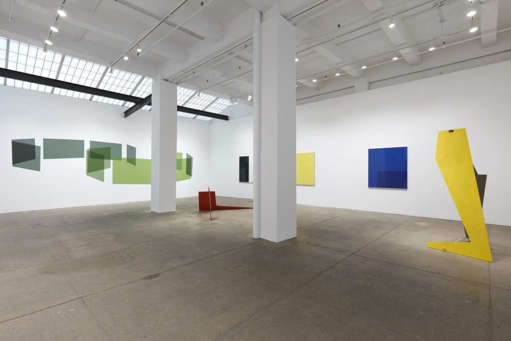
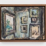
Shepherd has also included wooden sculptures based on the forms developed in her drawings. Each piece is cut from a single sheet of half-inch plywood and thinly stained in a bright color that still lets the wood grain show through. Like IKEA furniture, they fit together easily and can be taken apart for flat shipping or ready storage, although, unlike furniture, they impart a sense of fragility that’s unusual in geometric sculpture. They also exude a straightforward, no-frills vibe that feels more grounded than magical. Placed around the room, they are reflected in the shiny enamel surfaces of the paintings, doubling the shapes and adding to the work’s visual complexity in an intriguing way.

The back wall presents a big mural comprising eleven planes that seem to wrap around one another like a big numeral 9. They are painted in various greens determined by the SketchUp software to create the illusion of curving and overlapping. Ranging from cool, minty grey-greens to bright acidic yellow-greens, the planar shapes achieve trompe-l’œil surprise. Like all of Shepherd’s work, the mural leaves me wondering whether the image holds some symbolic meaning to the artist. That’s the charm – her work doesn’t beg for answers. In a world of loud, self-explanatory art, her pieces are quietly enigmatic, urging you to lean in and notice. They’re reminders of quieter questions about the strange alchemy that infuses inert geometry with feeling. It’s remarkable how constructed forms like these can make my heart skip.
“Kate Shepherd: ABC and sometimes Y,” Galerie Lelong, 526 W 26th St, New York, NY. Through February 8, 2025
About the author: Sharon Butler is a painter and the publisher of Two Coats of Paint.


Lovely review of cv lovely work. Thank you m. I’m on my way!
Sharon Butler is a pillar of strength insight and continuity. I love the way she writes and I like her art as well. Kate Sheperd has rekindled energy in a movement that has outlived it’s time. The work has a tickling sense of illusionism (moments of Fred Sandback come to mind).
Even though Sharon Butler panned my exhibition in 2012 at Untitled Gallery and it still smarts, I will not be prejudicded agaist Two Coats of Paint..
Joshua
Joshua,
Thanks so much for the kind words.
FWIW, I liked that show — the problem was more with the emphasis on the “impossibility of control, and the humiliation inherent in uncontrollability” emphasized in the press release. The final line of my post was meant to be positive: “…many of the objects are so formally handsome and painstakingly arranged that control seems entirely possible, if not the only possible outcome.”
This is an instance where I should have written more, but I wasn’t comfortable writing in a longer format. Short posts suited the old bloggy short-take format. Ah, how blogs have changed in the last 12 years. Thanks for continuing to read all these years.
Link to the 2012 post: https://twocoatsofpaint.com/2012/12/joshua-neustein-control-freak.html
All best,
Sharon