
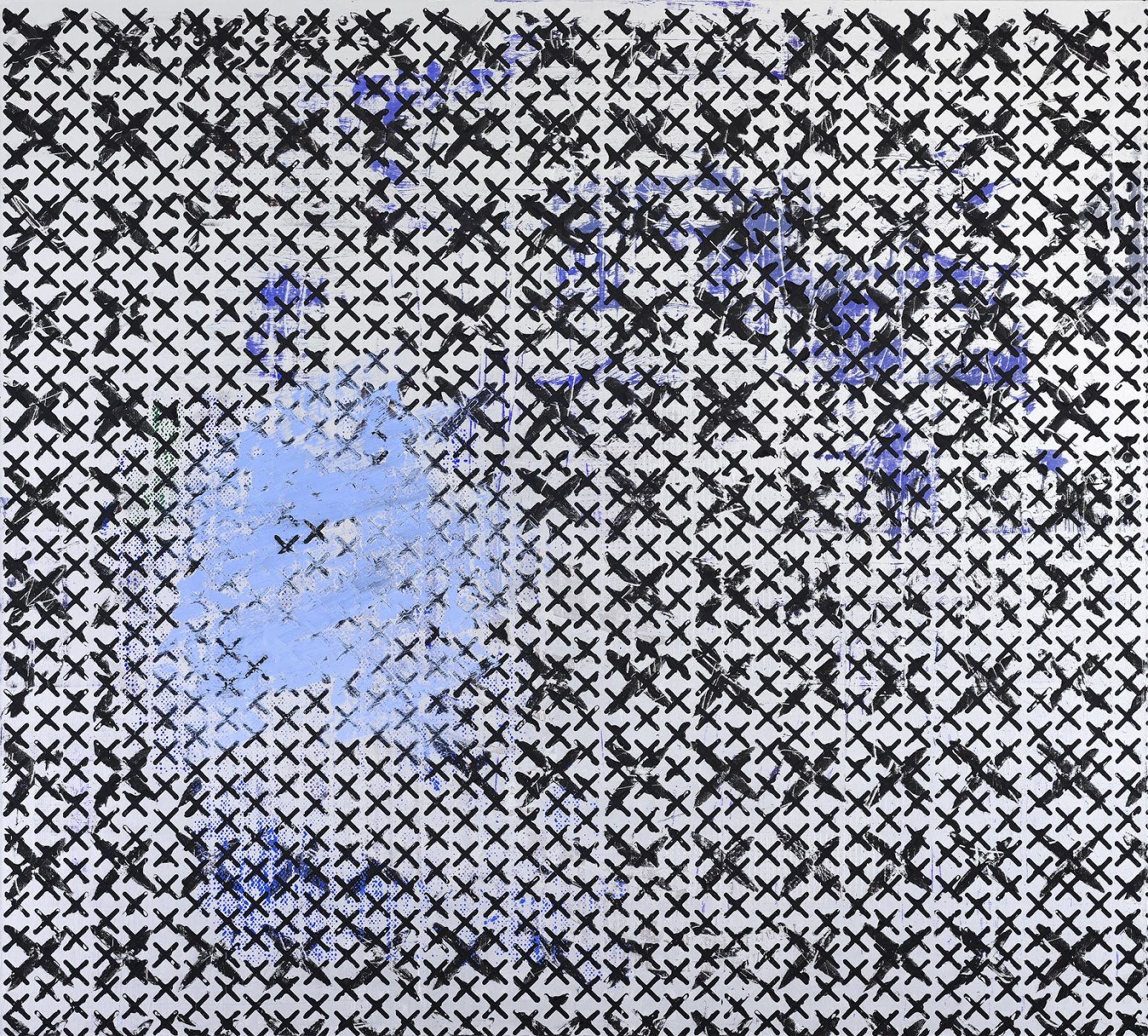
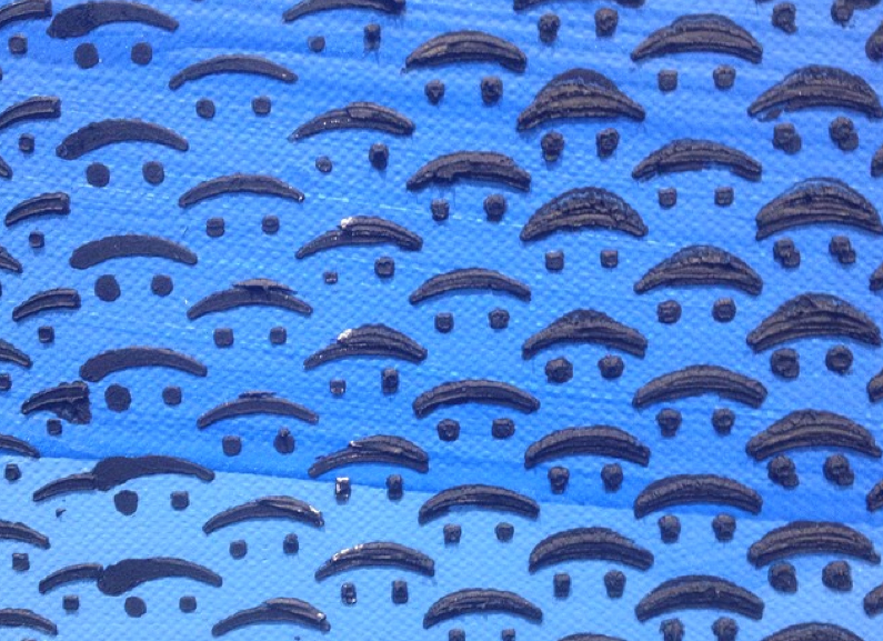
Contributed by Sharon Butler / Digital screens, halftone dot patterns, emoticons, and other typographic symbols comprise the imagery in Jacqueline Humphries’s new series of large-scale paintings on view at Greene Naftali through June 20. Once considered a Provisional painter, Humphries’s new work is anything but contingent. Slick and resolved, the enormous canvases are layered with stencils and screen prints so as to create the densely comprehensive patterns that we have come to associate with digitized information.

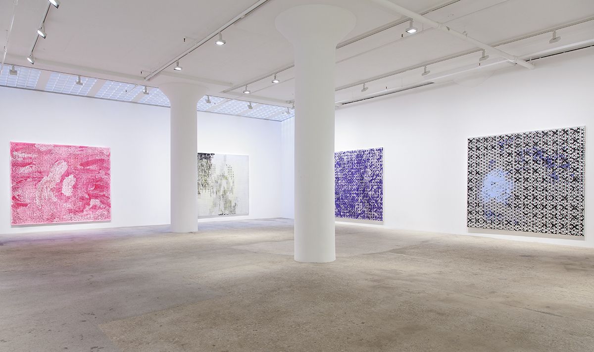
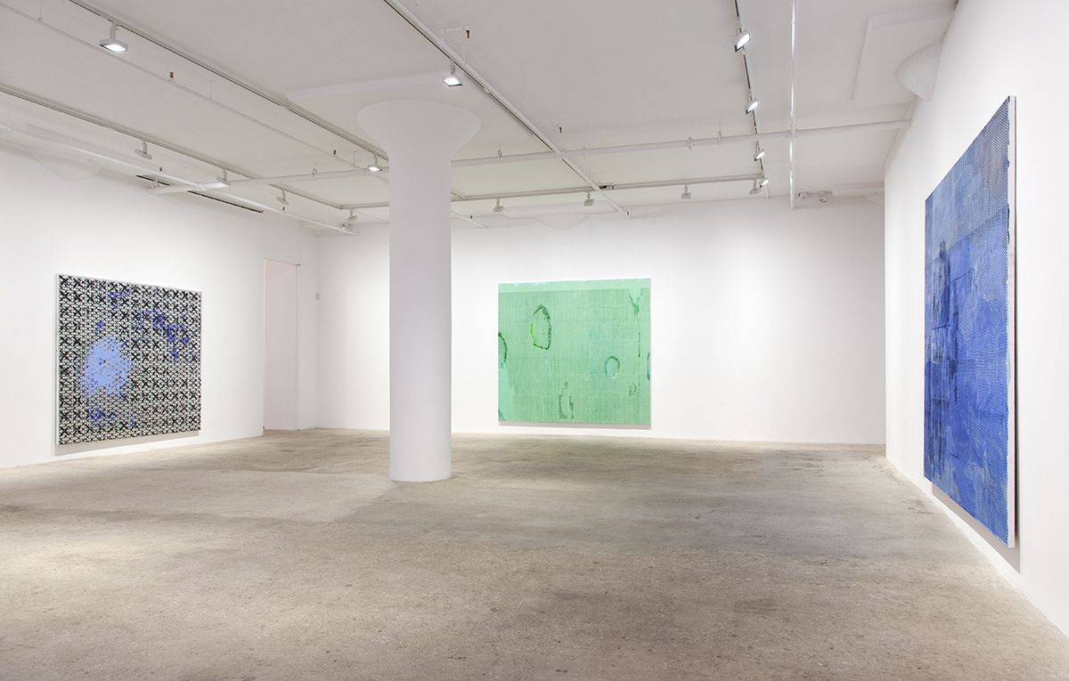
Humphries has always worked comfortably at a large scale, and these works seem to require the massive square footage. On each canvas, disruptions occur. Splotches of paint, uneven washes of color, agitated brushstrokes, and stencils clotted with paint are among the incidents that create surface texture and remind us that these are paintings–not details from the enormous digital screens like the ones wrapping the buildings in Times Square.
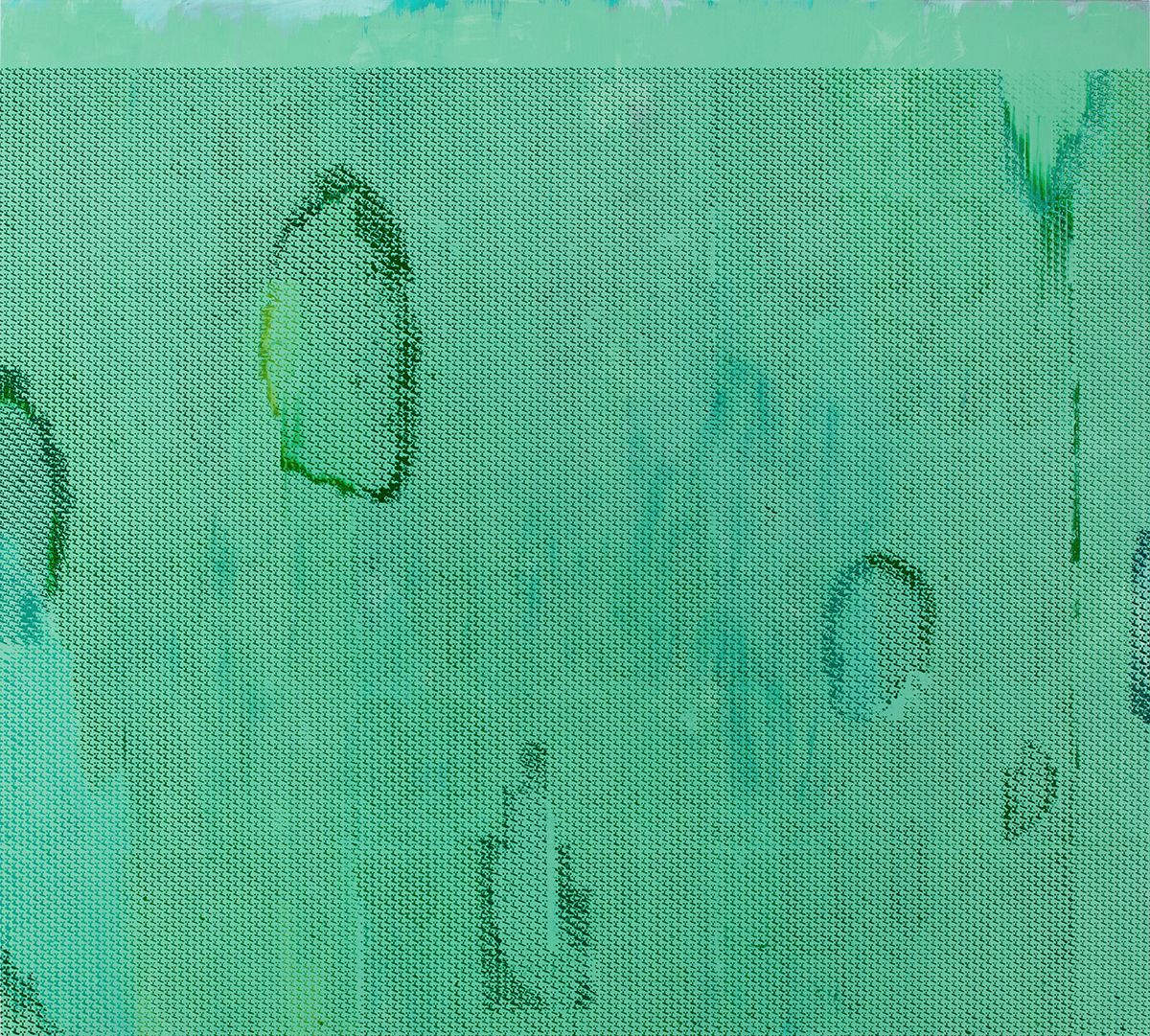
In older interviews, she describes “destroying the painting” and scraping away to find an image, but here the process is decisively additive. The images result from accumulated layers. Visually, they recall Christopher Wool’s screen print paintings, (some of which are on view at Luhring Augustine in Bushwick), but Humphries employs vivid color where Wool prefers bitmappy black and white. Many of the paintings begin with a layer of the silver paint that Humphries has been using for the past few years to give the paintings a kind of flickering, cinematic light that is difficult to capture in photographs. Her use of pattern and color draw our attention in the same way that we are drawn into our ubiquitous computer screens.
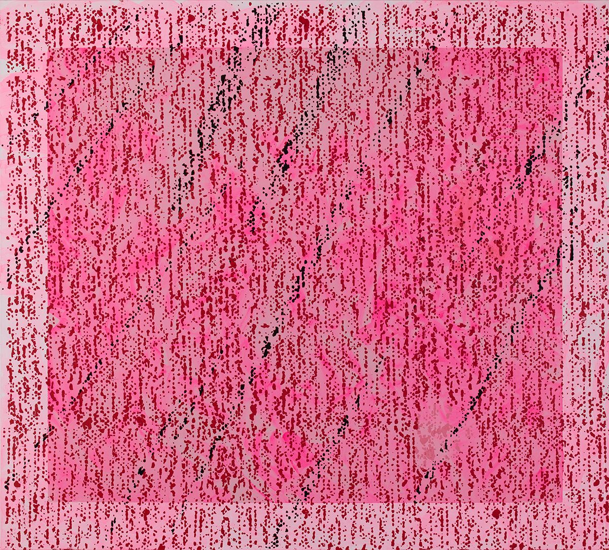
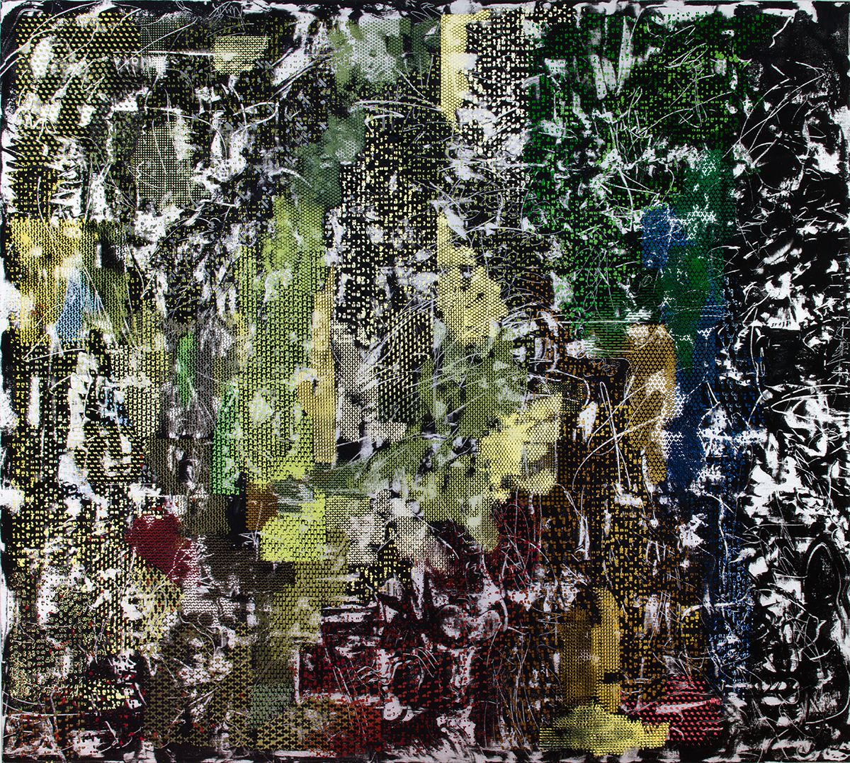
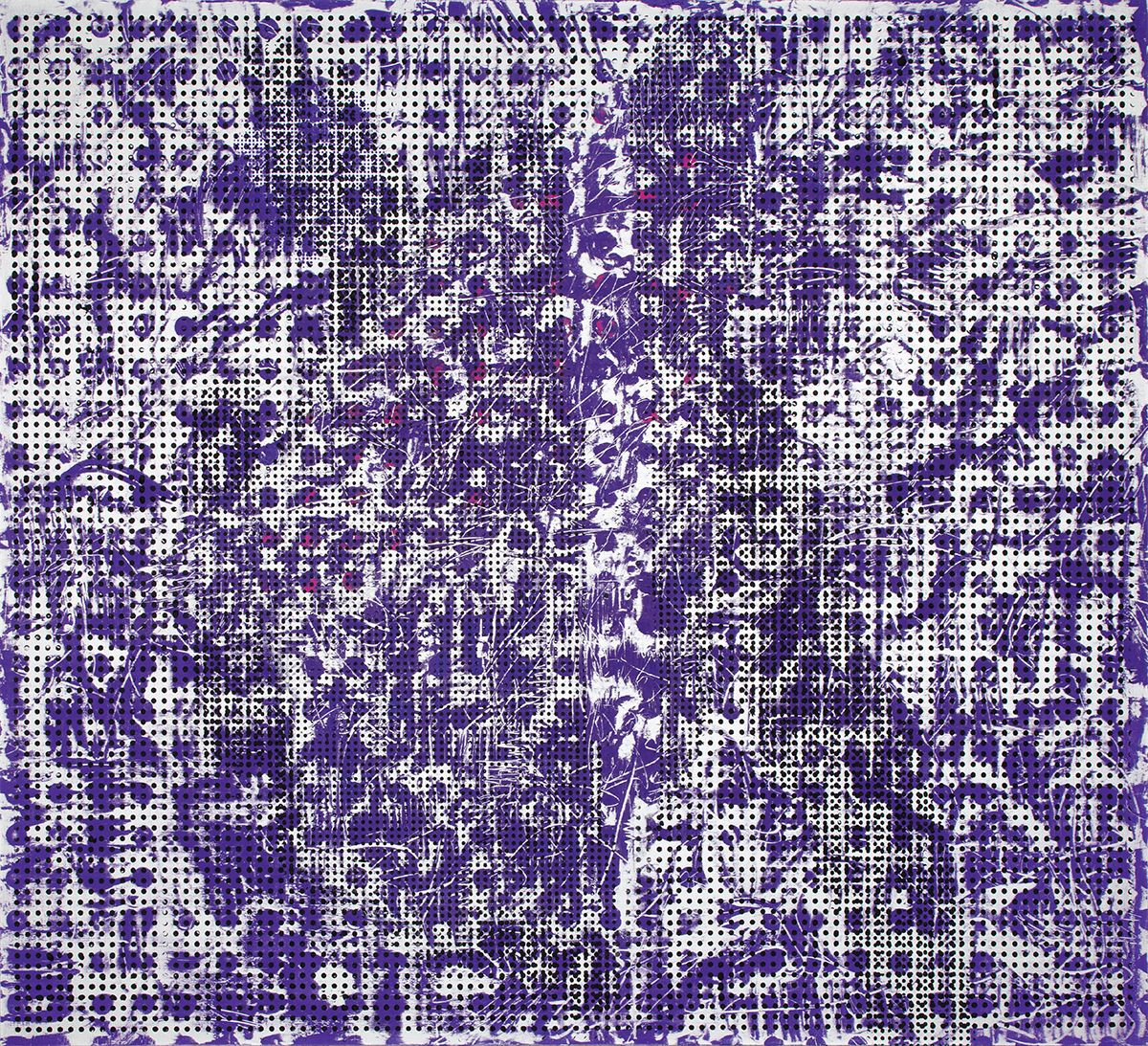
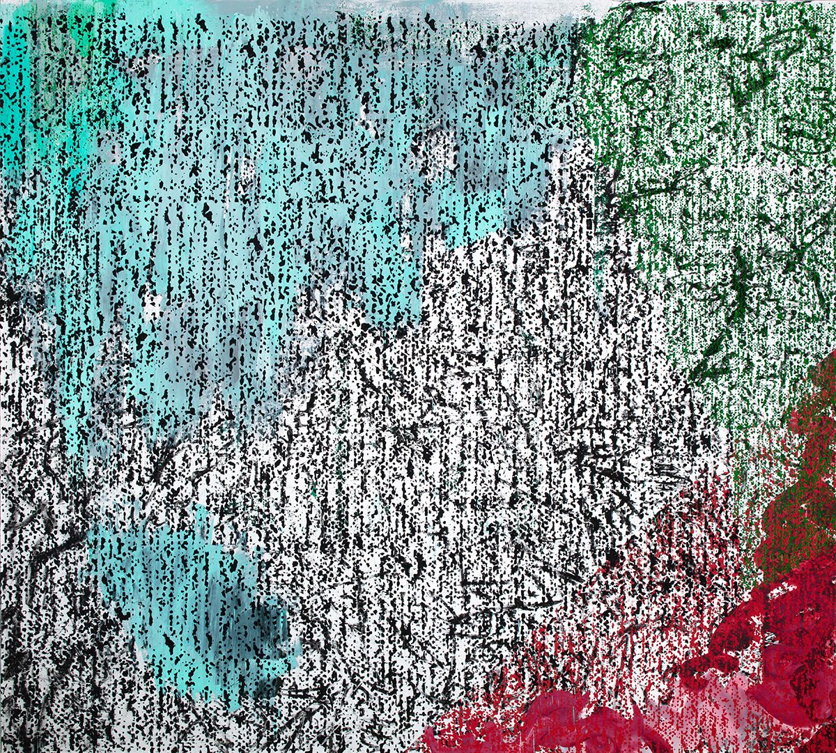
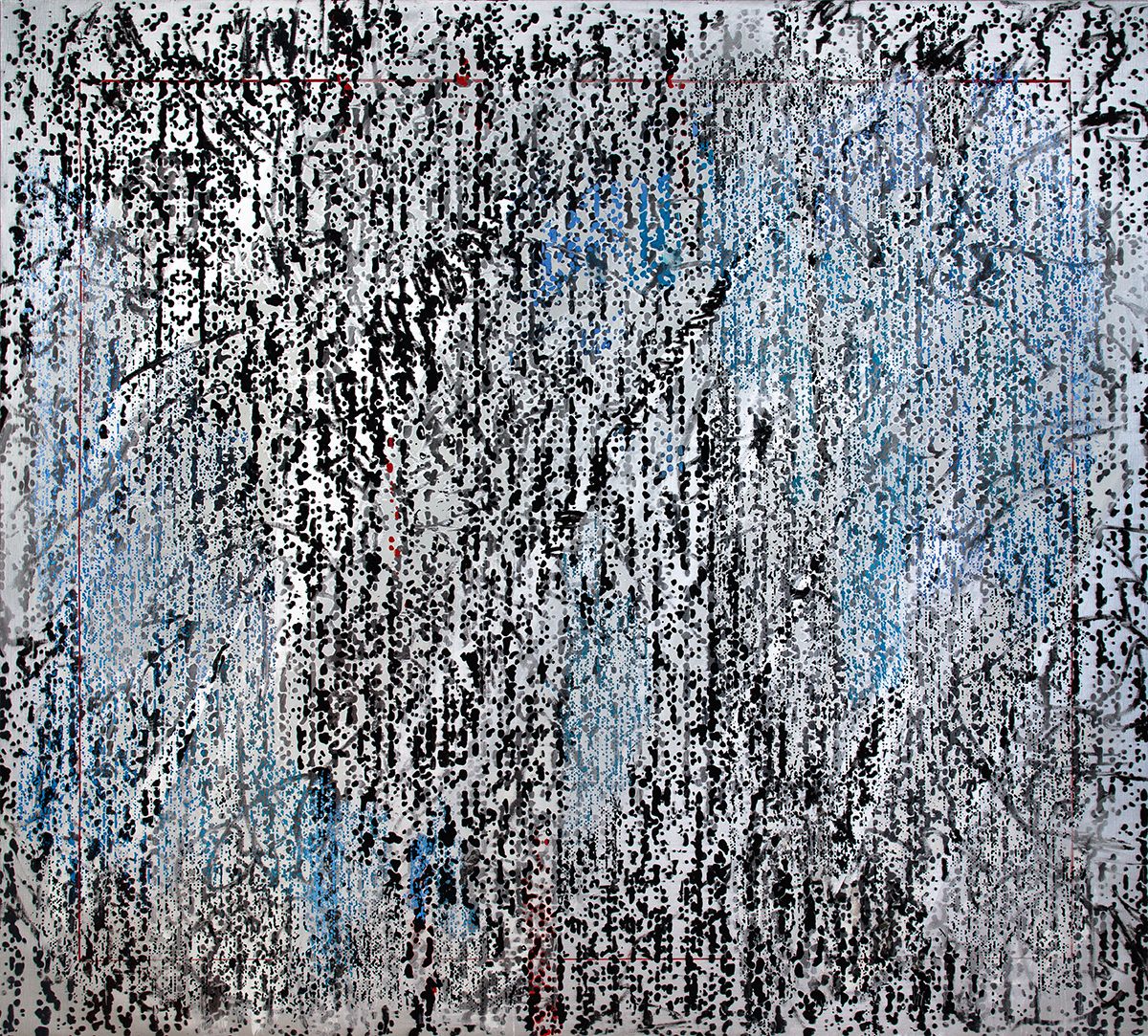
Indeed, like many painters today, Humphries references the “endemic distraction and proliferation of ever-emerging and fading images in a digital age.” The surprising inventiveness of her previous work, and with it some of the spontaneity, has�yielded to higher production values and assured bravado. This is a handsome series of�paintings, and very much of the moment.
“Jacqueline Humphries,” Greene Naftali, Chelsea, New York, NY. Through June 20, 2015.
Related posts:
——
Two Coats of Paint is licensed under a Creative Commons Attribution – Noncommercial-No Derivative Works 3.0 United States License. For permission to use content beyond the scope of this license, permission is required.


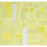


Admittedly commenting from an iPad screen, I see these works as transitional and a let down from her earlier work. The sweeping gestural dynamics has given way to pattern, a pattern that does not seem resolved in the artist's thinking, and a pattern that seems to get lost admist color and planarity, to use an old Formalist term. Her paintings, like Franz Kline's work best within the drama of black and white paint, leaving color like a blind date who brought their best friend along. There is also an overall greying out like the broadcast snow on an old tv left on when programming was over. It is as if technology is nothing more than a decorative two dimensional self-consciousness owned by no one, a vain attempt of painting to seem relevant in the age of the Internet. Abstract Seurat, maybe.