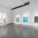
Contributed by Jacob Cartwright / Approaching Paul Corio’s current exhibition we might ask a question which hides in plain sight: what is it that we hope abstract painting might do nowadays? It has been thoroughly institutionalized and monetized so, while it may remain an obdurate challenge to a broader audience, it can no longer lay claim to radical or revolutionary aims. By definition non-objective art is partitioned off from exterior reference yet functionally it takes its place among cultural forms—from Bach’s fugues to Texas Hold’em—that are at once closed systems and also perennial sources of interpretation and societal value. One answer to this question would take into account abstract painting’s now trusty familiarity, a shelf-worn form that lacks the shock of the new yet, in the right hands, can still reap meaningful rewards and reliable surprise. The snappy color-driven works in Corio’s fourth solo at McKenzie Fine Art smartly develop the signature vein of geometric abstraction that he has presented with the gallery since 2016.

The paintings have always been crisp, with an unapologetically vivid—yet finely nuanced—color palette. Thus, Corio’s stock in trade has been a particular balance between an eye-catching image and more slowly unfolding visual sensation. Among the most compelling of the new paintings are those that delve deeper into the subtle perceptual shifts afforded by his rigorous approach to color organization—the painting King for a Day is a fine example. These works imply an atmospheric light that suffuses the whole picture. The gently shifting hues read as if we are never seeing local color, but rather radiantly infused light that is always emanating from some other unseen source. Color is both mood and phenomenon in these paintings, the softness of these impressions is remarkable given that the works meet every definition of hard-edged painting.

A crystalline painting like You Know I Know glints like the facets of cut gemstones and exemplifies the way that color occurs in these paintings as a seeming refraction. Even in their greatest moments of solidity, these works can exude a calm but hallucinatory elusiveness, as forms dissolve and colors transition so gracefully that it almost occurs below perception, like light and shadow gradually changing in a room.

The Thin Man, the largest painting in the main exhibition space, leans into an improvisational mode where a cascade of value allows for near total freedom of color, creating a flickering chromatic sensation as the eye scans the painting from top to bottom. There is an expansive energy in the piece that extends across the paintings in general, suggesting an avid assimilation of a variety of influences (as when Dutch De Stijl met New York City boogie woogie). The tumbling color in The Thin Man evokes the movement of neon light in the 1970s era Las Vegas Strip and the paintings overall have a Sinatra-like delivery: declarative yet relaxed, confident yet poised. In a word: cool.

Corio moonlights as a jazz drummer and displays an affinity with a couple drummers he no doubt admires: Ed Thigpen was known as “Mr. Taste” due to his recognition that clarity and economy could enhance the energy of a performance. Thigpen in turn liked to quote his fellow percussionist Philly Jo Jones in saying, “Make it sounds as big as possible, Not loud, but big…” This is drummer-to-drummer advice Corio himself seems to have internalized.
September 2022 is a good season in New York City for color-based abstraction, with Gabriele Evertz’s concurrent exhibition of new paintings at Minus Space. Like Evertz, Corio could be considered a second-generation Hunter Color School artist, having studied with Hunter professors Vincent Longo and Sanford Wurmfeld, artists who helped establish the college as a laboratory for color painting. A core group of Hunter Color School artists would certainly also include Doug Ohlson (1936-2010) and Robert Swain. The presence of professors such as Joanna Pousette-Dart, Valerie Jaudon, Lisa Corrine Davis, and Carrie Moyer makes the case for Hunter as an important locus for abstraction overall in recent decades.

Surveying the work of the Hunter color painters, who have all taken chromatic experience as their primary subject, it’s apparent that a methodological approach to color phenomena needn’t lead to a sameness of results from artist to artist. Corio and Evertz’s paintings make the case that a deep investigation of complex color relationships is in fact an exceedingly good way to tease out a view of an artist’s temperament and overall viewpoint. It’s impossible to stand in front of one of their paintings, experiencing the work as a vehicle for color sensations, and not walk away with a feeling for the artist’s attitude and predilections.
In Corio’s studio, the first impression is of stepping inside a small industrial cannery, thanks to the orderly but overwhelming presence of Mason jars. Each jar contains a paint color that has been mixed for the specific values, tints, and hues that are the essential components of his color system (the tight sealing lids required for fruit preserves also lend themselves to preserving pre-mixed paint). Color is often thought of in immaterial terms but the sprawl and collective heft of Corio’s palette serves as a reminder that, for the painter, a hue is quantifiable as a pure pigment and, as such, has body. This idea is carried over to the works themselves as he favors a precise but unfussy paint application that reinforces the painting’s unadorned objectness. Importantly, his straightforward application nudges you backwards, where the color becomes more disassociated from the surface and his optical constructions spring to life.
A notable feature of Corio’s practice, which is reflected in the current exhibition’s curation, is that he hasn’t staked out a single stylistic identifier in his work, but rather has developed a trusted repertoire of compositional devices. A visitor to The Metropolitan Museum of Art who enters the galleries devoted to the art of Imperial Rome will chance upon the source of one such familiar motif: a diamond lattice inlaid in a mosaic floor panel from the 2nd century.

Any painter who has explored those galleries will also recall their striking examples of Roman wall painting (c. 50-40 B.C.) and, with Corio having placed his flag in these galleries, it’s fascinating to consider their relationship to his paintings. Romans used these wall paintings to brighten their interior living spaces and their colored panels were meant to suggest expensive marble. The rare pigments also denoted wealth. In the examples at The Met we see what is likely red and yellow ochre, stacked atop celadon or, perhaps, Egyptian blue. The sense of overall space is tipped heavily towards an embrace of the wall’s flatness and its ability to deliver luxurious expanses of color. These paintings were ostensibly created to expand their attendant rooms yet illusionistic aspects are just as likely to appear in the geometric patterns found in the decorative trim. The correlations here with Corio’s paintings hardly need to be stated. What does bear special mention is that considering his work in relation to a concept of painting so closely tied to architecture clarifies the fundamentally architectonic way that he composes his space.

Artists working in abstract and non-objective modes have always been quick to see the precedent for their endeavors in ornament and architecture—we should check the pulse of any artist who hasn’t felt some sort of kinship with the Alhambra or the Pantheon. In 1906 Wilhelm Woringer posited a theory of art which cited a “will to abstraction” as one of the fundamental impulses that guided the creation of art throughout history, linking this impulse to a “psychic attitude towards the cosmos.” Despite abstraction’s routine association with the cosmic, Corio’s stated aim is to make his art a Dyonisan one, infused with earthly delight. It’s no coincidence that he plucks his titles from his other areas of earthly enthusiasm—horse racing, literature, film, jazz standards— tending to value the stimulating over the descriptive. All of this is to say that while most of the paintings can be reasonably regarded as non-objective, the artist’s intent is clearly to place the works in the world, with enlivening things of all kinds.
Corio grew up in an Italian American home and it’s an artistic ancestry he embraces, a fact exemplified by a trip to Rome whose itinerary he devoted to locating every painting by Carravagio that the capital city has to offer. It is interesting to recall a series of talks Frank Stella delivered at Harvard, the first of which in October 1983 was devoted to Caravaggio and how the artist navigated the wake of the high renaissance and the death of Titian. Stella describes the way that Caravaggio synthesized the monumental figuration of Rome with Venetian color and painterliness to achieve a new form of “pictoriality.” Stella called upon contemporary artists to seek out an equally compelling pictorial solution to abstract painting, citing his belief that postwar painting had become too enamored with materiality and close-valued color.
Corio arguably meets Stella’s job description: while the comparison might seem strained on the face of it, it’s apparent that Corio’s frontal yet resolutely spatial compositions are kin to Carravagio’s dynamic modeling of middle distance space. It’s also notable that Carravagio, more than anyone before him, made his work feel like a direct function of the day-to-day world—centuries later they still deliver the unshakable feeling that we might have passed one of his models on the street. Most importantly, both painters can make light itself feel sensual and utterly decadent. Color is unmistakably the source of the action in Corio’s work, so light and form are all articulated as a function of chromatic value. To borrow a final concept from Stella, the color space in the works is “projective” in that it comes out to meet the viewer in the form of developmental visual sensation, a pictorial experience that isn’t confined to the painting’s material limits.
In terms of a more direct lineage (outside of the aforementioned Hunter Color School), while Corio’s DNA certainly descends from the modernist color compositions of Josef Albers and Max Bill, as well as post painterly color field artists like Gene Davis, Larry Poons, and Thomas Downing, his concept of perceptual abstraction is impossible to disentangle from the color painters most firmly associated with first generation Op Art: Edna Andade, Julian Stanczak, Richard Anuszkiewicz, Bridget Riley, Julio Le Parc et al. The fact that so many of those artists, and the work they themselves have inspired, have hovered in a disputed zone that encompasses popular culture at least as much as the art world is not insignificant. Corio’s work always seems to be telling us that it is a thing to be experienced in the world like anything else—while being deeply considered it is a vision that is plain spoken with a vitality that is easy to apprehend.

The three small text-based works in the show make plain the thing-in-the-world quality of Corio’s painting. By choosing phrases made up of single syllable word combinations the paintings not only engage with the visual nature of linguistic signifiers, they also evoke the phonetic and song-like quality of speech. Seeing a phrase like “OH HI” rendered in Corio’s signature color system, and hearing the word combination in the head, one is reminded of the way speech is performed as a kind of percussive song. Circling back to Corio’s activities as a drummer, it’s notable that the most advanced and sensitive jazz drummers tune their drums so they can play the melody of a tune on their kit—a melody that in most standards was tied to lyrics, such that the pattering of the drums functioned as its own form of real time abstraction. One such standard, “These Foolish Things,” serves as the title for this exhibition.
Corio’s rigorous approach to color invites an equally precise and highly focused mode of perception, emphasizing the way that sense experience unfurls in the here and now. His paintings, even at their most non-objective, are as firmly located in the world and in the present moment when they are experienced as a heightened state of awareness. This approach celebrates the objects and activities that allow us to feel most fully present, that are at once familiar yet perpetually renewed in the moment. This elicitation of mindful seeing is among the things we can hope abstract paintings might still achieve.
“Paul Corio: These Foolish Things”, Mckenzie Fine Art, 55 Orchard Street, New York, NY. Through Oct 23.
“Gabriele Evertz: Path”, Minus Space, 16 Main Street, Suite A, Brooklyn, NY, 11201. Through Nov 19.
About the Author: Jacob Cartwright is a NYC-based painter and independent curator who writes about art.