

Contributed by Adam Simon / At first glance, Tom McGlynn’s paintings, on display at his solo show “What Gives” at Rick Wester Fine Art, seem to be examples of minimalist abstraction, free of narrative, subject, or anything associative. His arrangements of rectangles of solid color on a monochromatic field evoke modernism’s utopian origins: Mondrian, Van Doesburg, De Stijl, Neo-plasticism, painting purged of anything that could be thought extraneous. For contemporary abstract painters, however, these basic shapes are historically weighted signifiers, no longer free of association. One cannot now make a geometric abstract painting without it also being a depiction of a geometric abstract painting. McGlynn is fully aware of this doubling. For him, it isn’t a quandary as much as a defining characteristic of his work. What is remarkable is that, out of such seemingly depleted soil, he can conjure such visual richness.

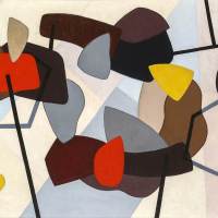
His work has never quite fit the high modernist category. His colors are weirdly evocative, evoking corporate décor, shopping malls, confections. They interact in a chatty and dramatic way. In a painting such as the eponymous What Gives, we are struck first by the surfeit of different colors, and then by the fact that shapes of such similarity are so chromatically different. The pink and purple connect somewhat, as do the orange and red, the orange and yellow, and the black and brown. But none of these connections hold enough to establish a true hierarchy. We are left with a sense of a heterogenous group of mismatched personalities, each jockeying for position on an unstable plane. Yet, the overarching effect is the opposite of entropy. Through precise calibration of differences and similarities McGlynn achieves a compelling equilibrium.


McGlynn could be linked to artists who employed minimalist abstraction as provocation, such as the 1960s BMPT group (Buren, Mosset, Parmentier and Toroni) or the Croatian painter Julije Knifer. In the early 1990s, McGlynn created a series that he referred to as “detournements” – a term associated with the Situationist International that means to redirect or hijack. His paintings were derived from corporate logos, cropped or subtly altered in ways that turned them into absurdist political commentary: Dunkin Donuts in the familiar typeface, reduced to the letters, OD (as in overdose), the familiar Marlboro logo with a black box replacing the brand name. Reductionist syntax generated narrative. This body of work scored him both the cover of Artforum (with Emily Carter) and a cease-and-desist lawsuit from Toys ‘R’ Us.

For two decades, McGlynn’s work has not referenced specific corporate logos. What remains is distillation and reduction and the idea that these rectangular forms function as signifiers, a kind of meta-abstraction. Like logos, McGlynn’s rectangles are part of a common vocabulary, albeit one that disguises a formally radical agenda. Repetition is part of the meaning embedded in the work. Individual paintings feel like pieces of an ongoing project to exhaust the iterative potential of a narrow set of parameters. The project’s impossibility is what qualifies it as poetic, or rather, as a convergence of poetry and perhaps mathematics. What doesn’t change is the structural relationship of smaller rectangles to the larger rectangle on which they are situated. What do change are the colors and the relationship of each color to the others, both individually and as a group. In Difference and Repetition, Deleuze paraphrases Hume to say that repetition is change that does not occur in the object but in the mind of the subject. It contracts past, present, and future into a kind of eternal present. But even stylistic repetition like McGlynn’s, in which individual works represent different instantiations of a single idea, is a way of compressing past, present, and future. As such, it can also be a way of addressing the public’s increasingly short attention span, and its need for reduction, sound bites, and branding.

That said, McGlynn’s paintings are beautiful. Unlike someone like, say, Daniel Buren, McGlynn is not repeating forms so that they function purely as signs. His colors are disparate but also coherent, with shapes that speak to one another through a vast array of differences and similarities. Like goes to like, a grey blue to slightly greener blue, a vertical rectangle to a horizontal approximately the same size. Likeness abounds but rarely settles into sameness. Connections constantly reconfigure, resisting stasis, and by the same token difference is never total. One senses that McGlynn began with the most artificial of constructs – almost a New Yorker cartoon version of modern art – only to be seduced by the aesthetics of color and paint, shape and space. His pleasure in fine-tuning relationships of similarity, equivalence, and difference is as evident as his pleasure in the repeated brushstrokes that never quite resolve into flatness.

As much as McGlynn’s rectangles are formal elements in a composition, they are actors in a drama. Relationships are social as much as visual. He accentuates this idea through the framing of the shapes. They never touch one another and never extend to the edge of the panel. Interstices compete for equal billing. As in the poster for the 1984 horror film Children of the Corn, we are confronted by a group standing mutely opposite the viewer, contained by their relations of sameness and difference, in a state of both dynamic tension and equanimity.
“Tom McGlynn: What Gives,” Rick Wester Fine Art, 526 W. 26th Street, Suite 417, New York, NY, Through June 30, 2023.
About the Author: Adam Simon is a New York artist and writer. His recent paintings combine corporate logotypes, stock photography, and tropes of Modernist design.


Excellent review. Greatly appreciate having the images and info of earlier work. I’m happy to own a small McGlynn – it promotes happiness.
Pleasure to read such an erudite review from an artist/writer who knows McGlynn’s work so well. From Deleuze to “Children of the Corn” makes perfect sense the way Simon tells it. It’s a wonderful review, enlightening and fun to read.