

Contributed by Patrick Neal / Stephen Maine’s abstract paintings, on view at Private Public Gallery in Hudson, NY, hit you head-on with their optically charged surfaces and imposing presence. The gallery, which has a penchant for showing large-scale work, is exhibiting in its main space several of Maine’s signature “residue paintings” – spongy, all-over compositions with gorgeous, saturated colors in acrylic on canvas – that are over eight feet by six feet. Accompanying them are some medium-scale pieces that flow into annexes.

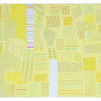
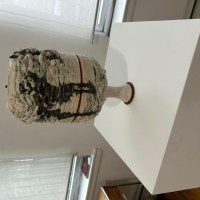
The show’s title – “Contact” – presumably stems from Maine’s unusually physical interaction with the canvas. To create his paintings, he uses a relief printmaking technique, pressing a flat plate covered in paint onto the face of the canvas. Made of Styrofoam and plywood, the plates are gouged and grooved with constellations of splotched and linear craters that serve as compositional blueprints. Beginning with a baseline coat of paint and working horizontally, Maine stamps a canvas with the same plate a few times over, applying a different color during each round. Using a hinged contraption, he exerts pressure from his own body as he pushes down and walks on top. This imprecise and homegrown approach to mark-making yields surprising effects in terms of surface texture, color, and composition. Two colors sometimes combine to yield a third, and transparent overlays result in novel hues. Irregularities in paint coverage, pressure, and alignment produce surfaces with puckered and craquelure patterns stylistically reminiscent of the torn poster aesthetic of Nouveau réalisme.

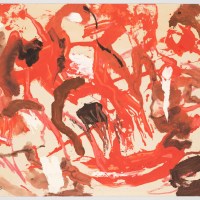
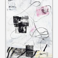
Despite the distinctly complex, almost baroque, nature of the compositions, the paintings are titled with no-nonsense number and letter combinations. Some works appear to be resolved with just two colors, others overlaid with possibly five or six. The color combinations range from subdued to electric. A few paintings have a streaky and thinned fresco-like quality. You can see the sweep of Maine’s paint roller, while the residual paint on top is viscous and blistered, reflecting the suction and emulsion of the plate lifting from the surface. Maine appears to vary the application of paint during each stamp of the print, and to interject fragments of material that break up any pronounced compositional regularity. One can make out the patterns and contours of mesh nets, slats, rings, possibly stencils, as in the lower right corner of P21-1221, where a letter-like glyph sits near the artist’s initials.


Maine uses the same plate across different paintings as he explores various color combinations. This becomes clear when his paintings are hung side by side, revealing like surface motifs despite having wildly different chromatic status. The layered impressions of paint made by the plates’ ragged intaglio marks suggest networks of full-frontal, edge-to-edge activity. Often, with their impastoed and mottled blotches and branches, the compositions resemble dendrites, corals, and sea anemones. P15-0777, in manganese violet over windshield green, looks riddled with the loopy blips and suckers of writhing tentacles. The imprint is oriented towards the top of the canvas and framed by the green background, recalling the figure/ground reversal in Mark Rothko’s Untitled (Green on Maroon). P22-0711, in regal deep golds and blues, is reminiscent of Max Ernst’s surreal landscape L’oeil du silence with its nubby frottage and grattage textures. P18-0430, looking like a speckled cluster of hot pink islands amid blue ocean, brings to mind Christo and Jeanne-Claude’s Surrounded Islands, Biscayne Bay, Greater Miami, Florida, 1980–83 as seen from a helicopter.

Maine’s work raises intriguing questions about expressivity as it relates to object and representation. While he eschews traditional means of mark-making and autographic gestures, he asserts his own sense of beauty at arm’s length by calibrating other factors. These include the saturation and viscosity of paint; the angle and timing of the plate in relation to the substrate; and gouging, abrading, and cropping in relation to drawing and gestalt. These factors are subject to accident and contingency no matter how rigidly planned the process may be up front. Warhol is an obvious pioneer of this “hands off” approach, but Maine’s paintings are more visually aligned than Warhol’s work with All-over painting in their glittering expansiveness.

The press release for “Contact” quotes Frank Stella’s famous anti-illusionistic quip that “what you see is what you see” as an admonition not to read into or look further than the strict material reality of an artwork. In conversation, Maine has lodged a similar sentiment: that cryptic autobiographical content doesn’t belong in his paintings. In this regard, despite their complex, improvisational, and unruly surface appearance, Maine’s process might be more on par with the impersonal tenets of Minimalism. What’s interesting to contemplate, with so many tactile traces held at a distance, is the degree to which the paintings remain expressive and visually arresting. Despite a distaste for overt representation, figurative allusions aren’t absent in Maine’s compositions. They just happen to arise incidentally through pareidolia – the human tendency to see images in abstract currents – or through visual preconceptions tethered to figure/ground and color relationships. With their evocative colors and surface details, I found myself giving the paintings associative descriptors like Sunspot, Topps Cards, Pit Viper, Tiki Bar Aquarium, Shroud of Turin, Paramecium Lab, Ceiling Mold, and Cabbage Leaf.

Using a printmaking process to make paintings is ingenious. Prints are traditionally cheaper versions of paintings, produced serially rather than as one-of-a-kind, and therefore generally considered inferior. Maine, in a wily twist, subverts this assumption by using a mechanical process to generate serial compositions that are in fact free-form, spontaneous, and unique. His work is charged with a formal and conceptual energy that compels us to consider the embedded process that occurs behind the scenes even as we enjoy viewing the output of that process in the gallery. In fact, the iterative aspect of Maine’s technique encourages us to look not just at one painting at a time, but across the gallery and beyond at other bodies of his work, to fully appreciate the depth and breadth of his impressive project.

At left: P18-0714, 2018, acrylic on canvas, 100×80 inches. Ar right: P18-0713, 2018, acrylic on canvas, 100×80 inches.
“Stephen Maine: Contact,” Private Public Gallery, 530 Columbia Street, Hudson, NY. Through February 26, 2023.
About the author: Patrick Neal, a regular contributor to Two Coats of Paint, is a painter, freelance art writer, and longtime resident of Long Island City. He recently completed a studio visit with Gorky’s Granddaughter as part of their video documentary series. In 2022, Neal attended the Hotel Belmar Artist Residency in Monteverde, Costa Rica; presented a solo exhibition of paintings at The Local NYC, Long Island City, NY; and curated “Luscious Wasteland: Cathy Diamond and Laurie Fader,” at Radiator Gallery, Queens, NY.


Beautifully written.
Thank you Patrick Neal, and thank you Sharon Butler for the opportunity
to be within your wonderful works at Two Coats of Paint.
Loved this piece! Glad you put photos of Maine’s contraption in there. Neal does a wonderful job of connecting the artist’s work to other methods, philosophies, and makers.
A well written review, accompanied by great photos. I hope to see the show!
Wendy Klemperer speaks the truth! The “behind the scences” thinking conjured in both the review and in experiencing the work is potent. An archaeology is definitely brought to the fore in these processes.
That is very interesting how you included the plate the artist used. What fun! Thanks