

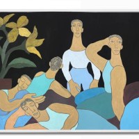
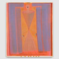
Conceptual artist Julie Wolfe’s show, “Opposing Forces,” at HEMPHILL in Washington, DC, is rooted in her practice of gathering images and data to explore the world around us and, just as importantly, our interior lives. Her intent is to guide the viewer through richly conceived systems of color, form, and language that often serve as markers of time. The exhibition includes large paintings on wool and paper, a series of abstract paintings, a space-scape diptych, and drawings on book pages. As the work develops, she makes artist’s books that explore similar concepts. A dialogue arises between the artwork and the books, which crystallize her visual ideas into intimate narratives contained in an object that viewers can hold in their hands while referencing the underpinnings of the artmaking process. The following list includes people, concepts, and sources that have influenced Wolfe’s work, along with her explanatory comments.
Julie Wolfe’s Ideas and Influences
1. Tacita Dean’s volcanic eruption in Vesuvio is inspired by a flea market postcard collection. Handwritten film directions appear in random placement and illustrate a convention unique to the Danish film industry of the recent past. Historically, two versions of the film were made, one with a happy ending and the other with a tragic one. The imagery and directions in Vesuvio indicate a tragic version.


acrylic and colored pencil on wood panel
84 x 60 x 2 1/2 inches
2. Batia Suter‘s books, Radial Grammar and Hexamiles, showcase her spontaneous use of random image association. The juxtaposed images tap into the optical unconscious to reveal something essential about perception and have driven my quest for meaningful connections between seemingly unrelated images.


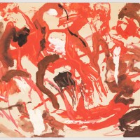
3. The book Kleksographian by Justinus Kerner (1786–1862) arrays inkblots used in a Victorian parlor game known as a “bestiary” – a seance around creatures appearing to crawl out of an inkwell. The inkblot, of course, has long been used for psychoanalytic tests and is the basis for the series of Rorschach shapes I make on wool felt. This series encourages viewers to meditate about what confronts them.


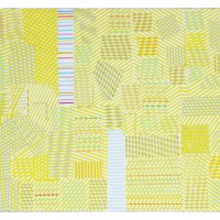
4. Color Problems by Emily Doyle Vanderpoel (1842–1939) predated Josef Albers’ color theories and used an original approach to color analysis and comprehension that informs my own color wheel and charting process. Vanderpoel “sought not so much to analyze the component of color itself, but rather to quantify the overall interpretive effect of color on the imagination.”


Gouache and archival pigment print on found book page,
21 1/4 x 12 1/4 inches

5. Solarquest is a 1980s boardgame similar to Monopoly, but focusing on Space Age real estate. It poses questions about our role within an expanding universe and spiked my curiosity while aesthetically informing my space-scape diptych.


acrylic, colored pencil, and chalk on wood, 48 x 120 3/8 x 2 1/2 inches
6. In 1974, Viennese architects Gunther Domenig and Eilfried Huth submitted drawings of potentially habitable worlds for a competition. They envisioned industrialized urban dwellings in a complicated open framework that suggested the use of organic materials. Their fantastical color drawings inspired my own architectural renderings, printed on paper and layered with other images in novel arrangements to suggest dynamic practical uses of time and space.


7. Hannah Höch (1889–1978) explored themes like gender and identity to critique popular culture through photomontage by appropriating and recombining images and text. Components of Höch’s collages played an important role in Cradling the Singing Bird, a recent presentation of my work by the publisher Pan and The Dream. This book is one of three accompanying my current exhibition.


8. Phillip Glass, Lucinda Childs and Sol LeWitt’s collaborative masterpiece, Dance, made in 1979, moved me to experiment using a palimpsestic process of overprinting and superimposing images. LeWitt’s film, projected on a transparent curtain in front of the stage, depicts the dances from different angles in sync with the live dancers, lending different shapes to space and time. This innovation thus broached the possibility of a dimension in which apparent real time co-exists with an alternative construct of time.


9. The intricate drawings of Agnes Denes (b.1931) reflect her interest in science and artistic expression and her concern for aesthetic presentation. Her work is based on a unique and eloquent translation of form and space but was never meant to be realized in three dimensions. My “Floor Plan” contemplates that possibility as an extended universe. While the viewer may not fully comprehend the intellectual content of her image, he or she can appreciate its beautiful execution and unusual apprehension of form and space.


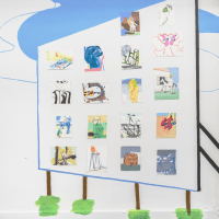
10. Photographer Taryn Simon‘s meticulous methods of categorizing visual information accumulated over years of sifting through letters, memos, images and other ephemera help validate an artist’s compulsion to collect. Over the course of five days, Simon took 1,075 photographs of items seized by customs at Kennedy International Airport. Some – drugs, weapons, counterfeit Louis Vuitton accessories – aren’t surprising, but others – cow dung toothpaste, insect larvae, a pitcher of salami – are gobsmacking. Over the years, my own personal visual archive has become integral to the development and execution of my work.

Julie Wolfe, Opposing Forces, HEMPHILL Artworks, 434 K Street NW, Washington DC, 20001. Through October 29, 2022. UPCOMING: “A Conversation with Julie Wolfe & Tim Doud,” Saturday, October 29, 10am. Registration Required.
Related post:
Two Coats of Paint artist-in-residence: Julie Wolfe


Wonderful that Two Coats of Paint has reviewed Julie Wolf’s work. She has an amazing art practice and Hemphill gallery is top notch here in DC!